Till Nagel Geo Visualization & Tangible Interaction
Till Nagel was a postdoctoral research fellow at the Urban Complexity Lab, FH Potsdam. His research interests are in geovisualization, urban data, and interaction design, with a focus on how to engage general audiences with interactive displays of spatiotemporal data.

Projects Contributions
 Project
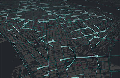
cf. city flows
A comparative visualization of urban bike mobility.
 Project
Is the bus late? Or did I miss it?
A visual analysis of public transport real-time data
 Project
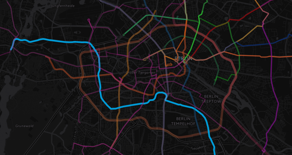
Shifted Maps
Revealing networks in personal movement data
 Project
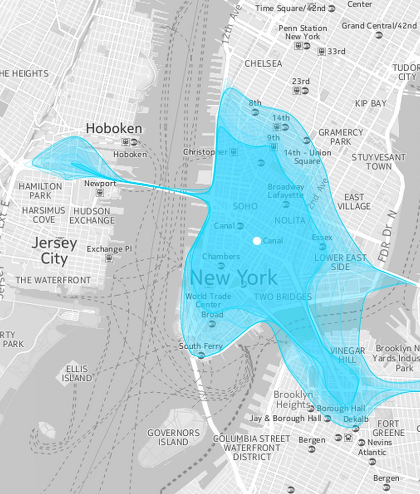
Isoscope
Mapping the time-varying extent of urban mobility
 Project
Unfolding
A library for interactive maps
Publications Published Works
Unravelling the Human Perspective and Considerations for Urban Data Visualization
Effective use of data is an essential asset to modern cities. Visualization as a tool for analysis, exploration, and communication has become a driving force in the task of unravelling our complex urban fabrics. This paper outlines the findings from a series of three workshops from 2018-2020 bringing together experts in urban data visualization with the aim of exploring multidisciplinary perspectives from the human-centric lens. Based on the rich and detailed workshop discussions identifying challenges and opportunities for urban data visualization research, we outline major human-centric themes and considerations fundamental for CityVis design and introduce a framework for an urban visualization design space.
Shifted Maps: Revealing spatio-temporal topologies in movement data
We present a hybrid visualization technique that integrates maps into network visualizations to reveal and analyze diverse topologies in geospatial movement data. With the rise of GPS tracking in various contexts such as smartphones and vehicles there has been a drastic increase in geospatial data being collect for personal reflection and organizational optimization. The generated movement datasets contain both geographical and temporal information, from which rich relational information can be derived. Common map visualizations perform especially well in revealing basic spatial patterns, but pay less attention to more nuanced relational properties. In contrast, network visualizations represent the specific topological structure of a dataset through the visual connections of nodes and their positioning. So far there has been relatively little research on combining these two approaches. Shifted Maps aims to bring maps and network visualizations together as equals. The visualization of places shown as circular map extracts and movements between places shown as edges, can be analyzed in different network arrangements, which reveal spatial and temporal topologies of movement data. We implemented a web-based prototype and report on challenges and opportunities about a novel network layout of places gathered during a qualitative evaluation.
Staged Analysis: From Evocative to Comparative Visualizations of Urban Mobility
In this paper we examine the concept of staged analysis through a case study on visualizing urban mobility exhibited in a public gallery space. Recently, many cities introduced bike-sharing in order to promote cycling among locals and visitors. We explore how citizens can be guided from evocative impressions of bicycling flows to comparative analysis of three bike-sharing systems. The main aim for visualizations in exhibition contexts is to encourage a shift from temporary interest to deeper insight into a complex phenomenon. To pursue this ambition we introduce cf. city flows, a comparative visualization environment of urban bike mobility designed to help citizens casually analyze three bike-sharing systems in the context of a public exhibition space. Multiple large screens show the space of flows in bike-sharing for three selected world cities: Berlin, London, and New York. Bike journeys are represented in three geospatial visualizations designed to be progressively more analytical, from animated trails to small-multiple glyphs. In this paper, we describe our design concept and process, the exhibition setup, and discuss some of the insights visitors gained while interacting with the visualizations.
Shanghai Metro Flow
One of the main characteristics of cities is the large amount of people moving around. These flows are reflected in all the subways dashing through the city. With our work we strive to give an impression of this pulse of the city. We present Shanghai Metro Flow, consisting of an animated visualization composed of three scenes, each giving another perspective into the metro network, and an accompanying poster showing subway line details. Each visualization combines established techniques with a highly aesthetic form in order to attract people to observe and dwell on different aspects of urban mobility.
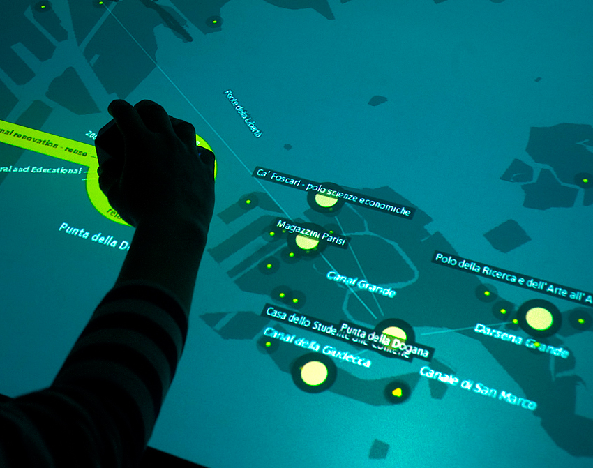
Making three Cases for Casual Geovisualizations on Interactive Surfaces
In this paper, we present three case studies on visualizing spatiotemporal data on interactive tabletops and surfaces for casual use. While there is a growing interest among citizens to make sense of their social community and urban environment, most existing geovisualization tools have been designed for experts such as planners and analysts. We introduce situation-specific visualization systems that were particularly designed for public exhibitions to balance powerful data exploration methods with inviting accessibility for laypeople. Finally, we discuss some of the lessons learned regarding people’s interest, interaction conventions, and information aesthetics.
Are there networks in maps? An experimental visualization of personal movement data
Shifted Maps proposes a novel visualization method to generate personal geovisualizations of individual movement data. The resulting visual appearance can be characterized as a map network consisting of visited places and their connections. The visited places are shown as circular map extracts scaled according to the time spent there and the movements between the places are represented as edges between the places. A key feature of the Shifted Maps visualization is the possibility to explore the data in three different arrangements based on geo-spatial position, travel time, and frequency of movements. By combining map and network visualizations of movement data, it becomes possible to analyze and compare spatial and temporal topologies.
Traffic Origins: A Simple Visualization Technique to Support Traffic Incident Analysis
Traffic incidents such as road accidents and vehicle breakdowns are a major source of travel uncertainty and delay, but the mechanism by which they cause heavy traffic is not fully understood. Traffic management controllers are tasked with routing repair and clean up crews to clear the incident and often have to do so under time pressure and with imperfect information. To aid their decision making and help them understand how past incidents affected traffic, we propose Traffic Origins, a simple method to visualize the impact road incidents have on congestion. Just before a traffic incident occurs, we mark the incident location with an expanding circle to uncover the underlying traffic flow map and when it ends, the circle recedes. This not only directs attention to upcoming events, but also allows us to observe the impact traffic incidents have on vehicle flow in the immediate vicinity and the cascading effect multiple incidents can have on a road network. We illustrate this technique using road incident and traffic flow data from Singapore.
Isoscope — Visualizing temporal mobility variance with isochrone maps
Isochrone maps are an established method to depict areas of equal travel time, and have been used in transportation planning since the early 20th century. In recent years, interactive isochrone maps allowed users to select areas of interest, or explore temporal mobility patterns for different modes of transport. However, conventional isochrone maps depict one traffic situation at a time. Our visualization approach unifies isochrone maps with time-varying travel data, and instead of showing multiple isolines for different travel times, we show multiple isolines for different times of day in order to reveal time-dependent spatial travel variance. In this paper, we present Isoscope, a web application that provides an interactive map for casual exploration of urban mobility patterns. Through its aesthetic visual form and its simple interface we strive to support people casually investigating travel time in their own city. We will describe our design goals, elaborate on the design and implementation of our prototype, and discuss limitations and future extensions of the system.
Touching Transport – A Case Study on Visualizing Metropolitan Public Transit on Interactive Tabletops
Due to recent technical developments, urban systems generate large and complex data sets. While visualizations have been used to make these accessible, often they are tailored to one specific group of users, typically the public or expert users. We present Touching Transport, an application that allows a diverse group of users to visually explore public transit data on a multi-touch tabletop. It provides multiple perspectives of the data and consists of three visualization modes conveying tempo-spatial patterns as map, time-series, and arc view. We exhibited our system publicly, and evaluated it in a lab study with three distinct user groups: citizens with knowledge of the local environment, experts in the domain of public transport, and non-experts with neither local nor domain knowledge. Our observations and evaluation results show we achieved our goals of both attracting visitors to explore the data while enabling gathering insights for both citizens and experts. We discuss the design considerations in developing our system, and describe our lessons learned in designing engaging tabletop visualizations.
A Visual Survey of Arc Diagrams
Surveys are a common way of providing an overview over a family of visualization techniques. In this poster we focused on arc diagrams, which are an established method to visualize relations between nodes in a simple path graph, and are laid out in one dimension. We collected a wide range of examples of arc diagrams with different characteristics. Following Jurgensmann and Schulz’s poster on tree visualizations we present our collection as a visual survey. As a result, our poster acts as visual reference and as inspirational source.
Unfolding — A Library for Interactive Maps
Visualizing data with geo-spatial properties has become more important and prevalent due to the wide spread dissemination of devices, sensors, databases, and services with references to the physical world. Yet, with existing tools it is often difficult to create interactive geovisualizations tailored for a particular domain or a specific dataset. We present Unfolding, a library for interactive maps and data visualization. Unfolding provides an API for designers to quickly create and customize geo-visualizations. In this paper, we describe the design criteria, the development process, and the functionalities of Unfolding. We demonstrate its versatility in use through a collection of examples. Results from a user survey suggests programmers find the library easy to learn and to use.
Unfolding — A Simple Library for Interactive Maps and Geovisualizations in Processing
Many thematic maps and geovisualizations nowadays are being created by designers, journalists, and other non cartographers. Yet, with existing tools it is often difficult to create interactive data visualizations tailored for a particular domain or a specific dataset. We present Unfolding, a library to simplify the creation of interactive maps and geovisualizations. Unfolding provides an API to quickly create and customize visualization applications. In this paper, we introduce the design and functionality of our library. We demonstrate its usability through a collection of examples, and confirm the apparent need of such map library by describing its acceptance in the community.