Isoscope Mapping the time-varying extent of urban mobility
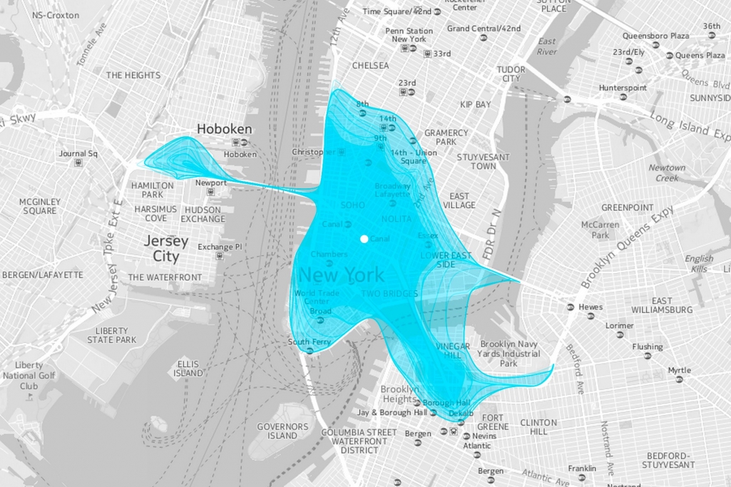
As we think about traffic in cities as somewhat like the pulse of the city, Isoscope is an approach to capture this rhythm with its up and downs. It’s an interactive tool that creates aesthetic visuals about locations that are reachable by car in a chosen time from a chosen location.

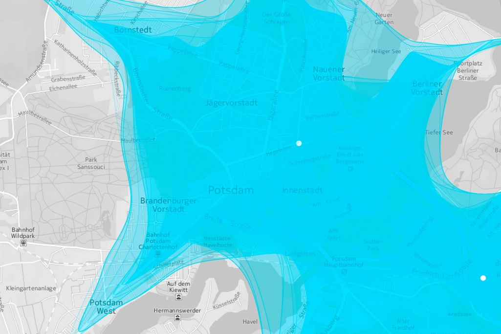
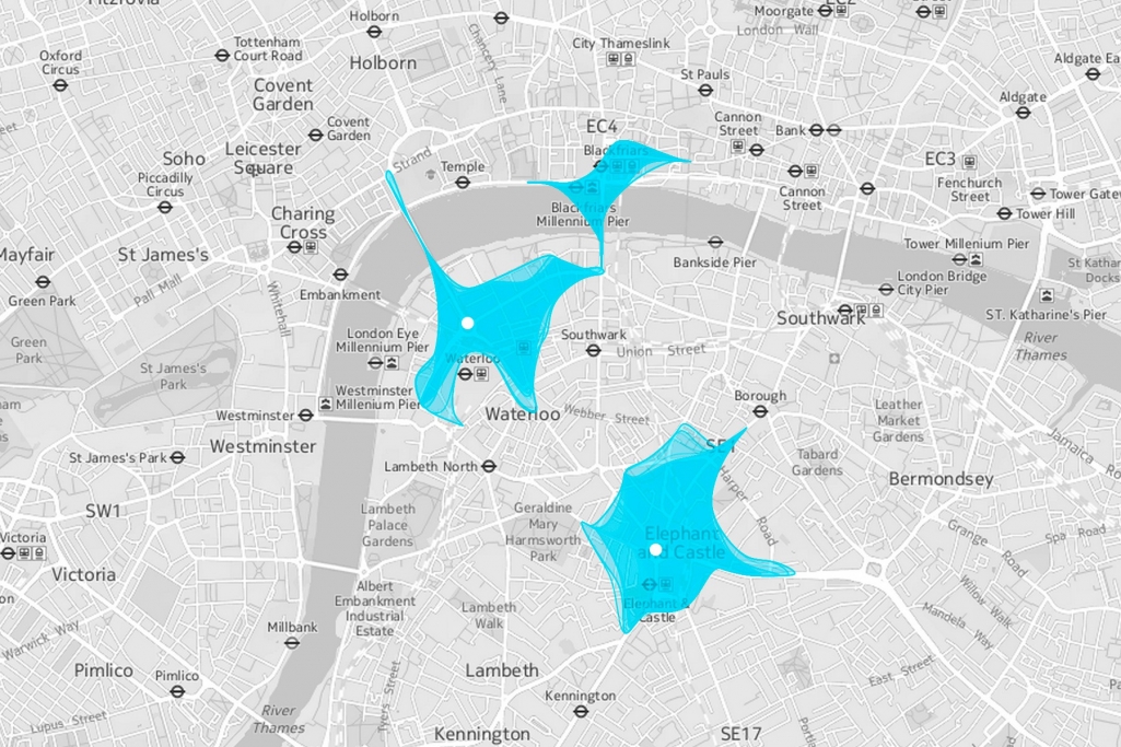
The boundaries of the reachability is shown by 24 layered organic shapes, while one layer represents one hour of the day. The output reveals many information like the traffic infrastructure, connectivity of regions and natural boundaries. Since the location to choose is not exclusive, places all over the world can be explored and compared.

We drive to the closest supermarket, take the bike to the gym or walk to the cafe next door for a nice chat among friends. Getting around — thus mobility — is an essential part of our being. We were especially intrigued by those situations when our mobility is compromised such as in traffic jams or during tough driving conditions. How do those restrictions impact our journeys through the city and who is affected most? Obviously, a car can hardly bypass a traffic jam, whereas a bike is more flexible to continue its journey. Let alone the pedestrian who can stroll wherever he wants to. Isoscope tries to answer the questions above by comparing different means of transport and their sensitivity for disturbances.
Once you are stuck in bad traffic conditions, you will need more time to cover the planned distance. In other words: stuck in a traffic jam, you will cover a smaller distance in a predefined amount of time. This is, what Isoscope is about: layered shapes show the area around a chosen location that is reachable within a chosen travel time. As traffic conditions change throughout the day, there are 24 layered shapes – each representing one hour of the day.
With Isoscope one can easily see and compare the influence of traffic conditions on our mobility or compare the reach of different means of transport. Within or among cities. Worldwide.

