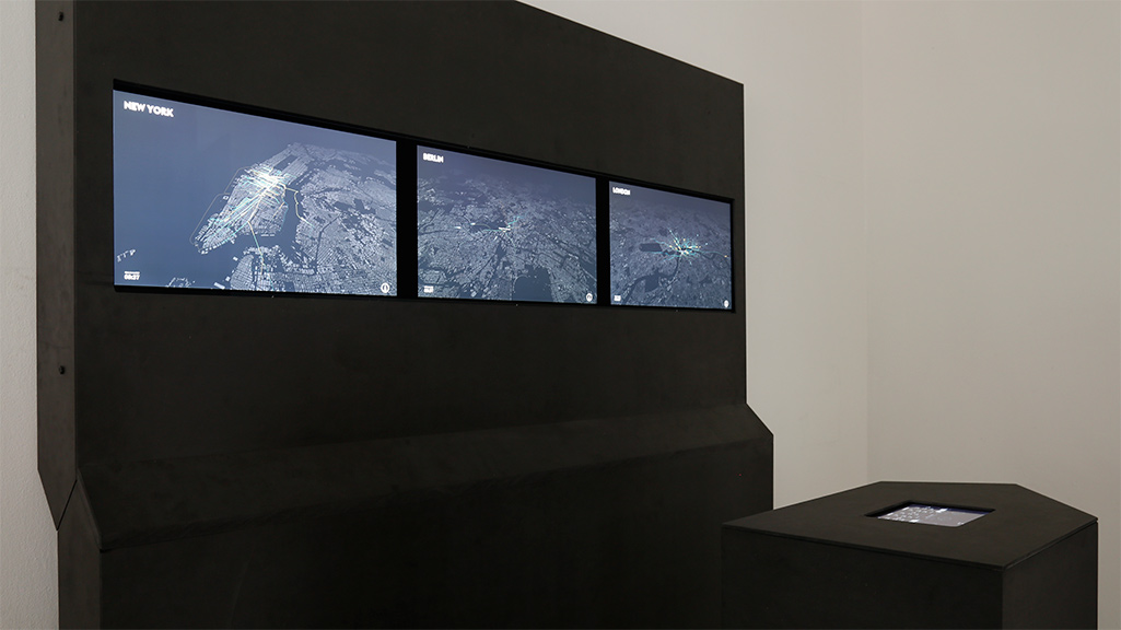
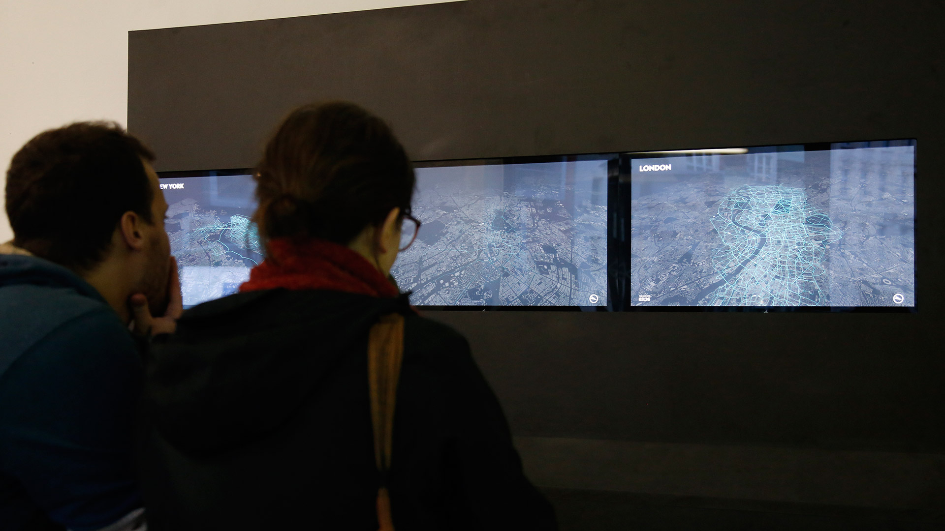
Three high-resolution screens show the space of flows of New York City, Berlin, and London through visualizing the bike-sharing systems of these global cities. By showing the flow of multiple cities side by side, we can compare their extent and dynamics. Tracing urban movements accentuates different urban structures, and contrasts grid-plan cities like New York with historically grown cities such as Berlin. It also enables us to observe and dwell on similarities and differences in various bike-sharing systems. With our visualizations we want to understand the pulse of urban mobility and create portraits of a city defined by its transient dynamics.
Cycling is increasingly recognized as critical component of future urban mobility. Riding a bike is largely independent of other traffic and unaffected by road congestion, and has health and environmental benefits. In the last few years, many cities around the world installed bike-sharing systems in order to stimulate casual use of bicycles by locals and visitors alike. We used data from these systems to visualize various aspects of bike-sharing mobility.
cf. city flows is an installation that combines multiple visualizations of bike-sharing journeys in three cities. It applies established mapping and visualization techniques within a highly aestheticized framework in order to animate visitors to engage with urban mobility.
cf. city flows has three viewing modes, all visualizing trips of rented bikes, but focusing on different levels of spatial and temporal granularity of cycling mobility:
Visitors can switch between these viewing modes resulting in smooth transitioning into the next scene. Each view shows an animation moving through the day and highlights bike trips of the current time with a fading trail for better visibility. The views of all three screens are temporally and spatially coordinated, showing the same time of day and having the same map scale.
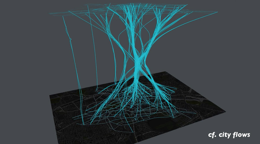
Lacking actual GPS tracks, the trip trajectories are rendered as smooth paths of the calculated optimal bike routes (see Methodology for details). As different trajectories still share some segments of the street network, aligning the bike movements with actual roads makes it possible to compare the accumulated use of urban infrastructure.
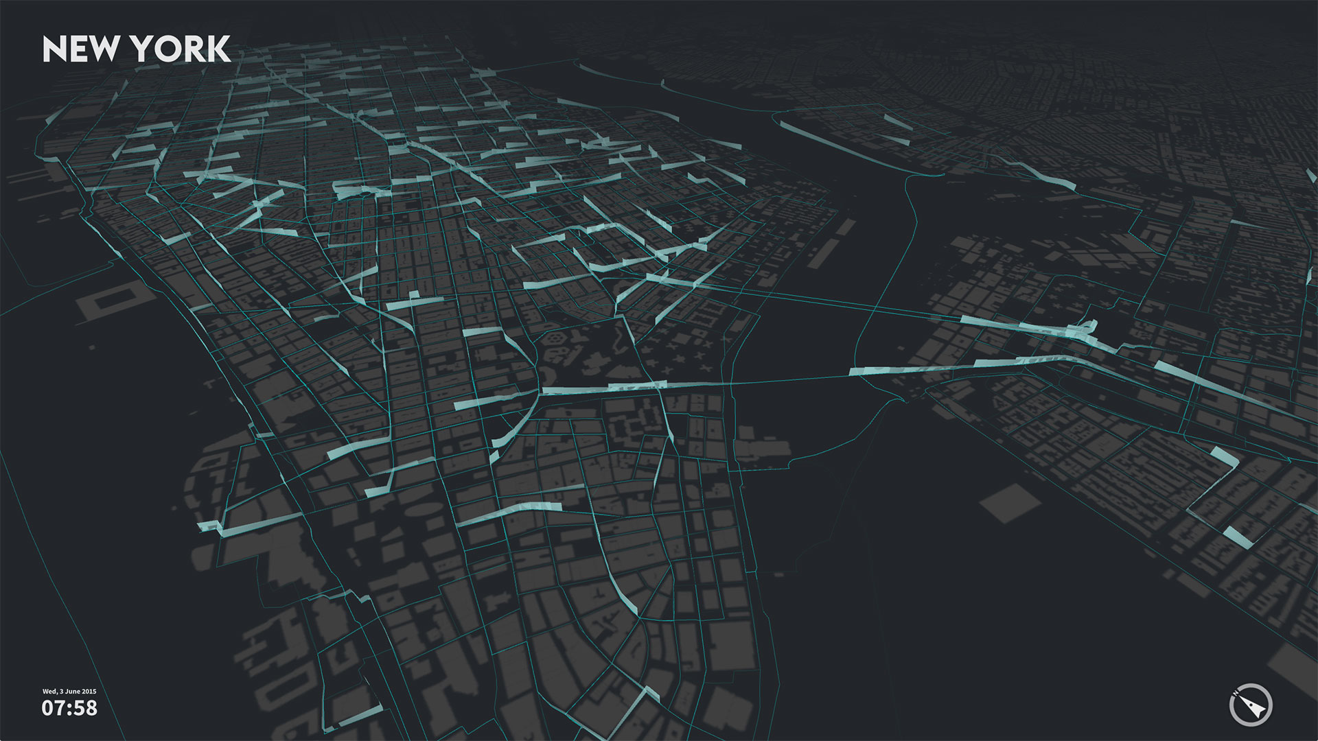
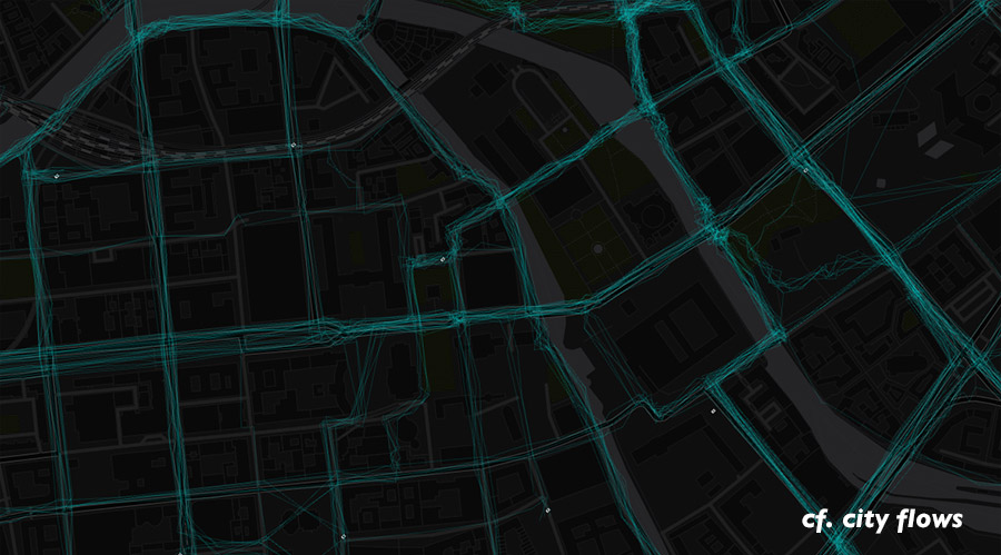
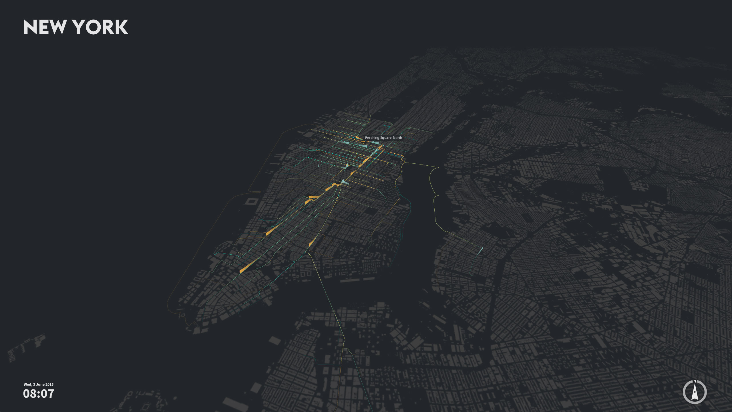
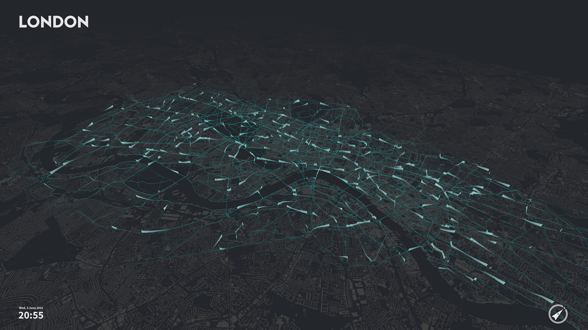
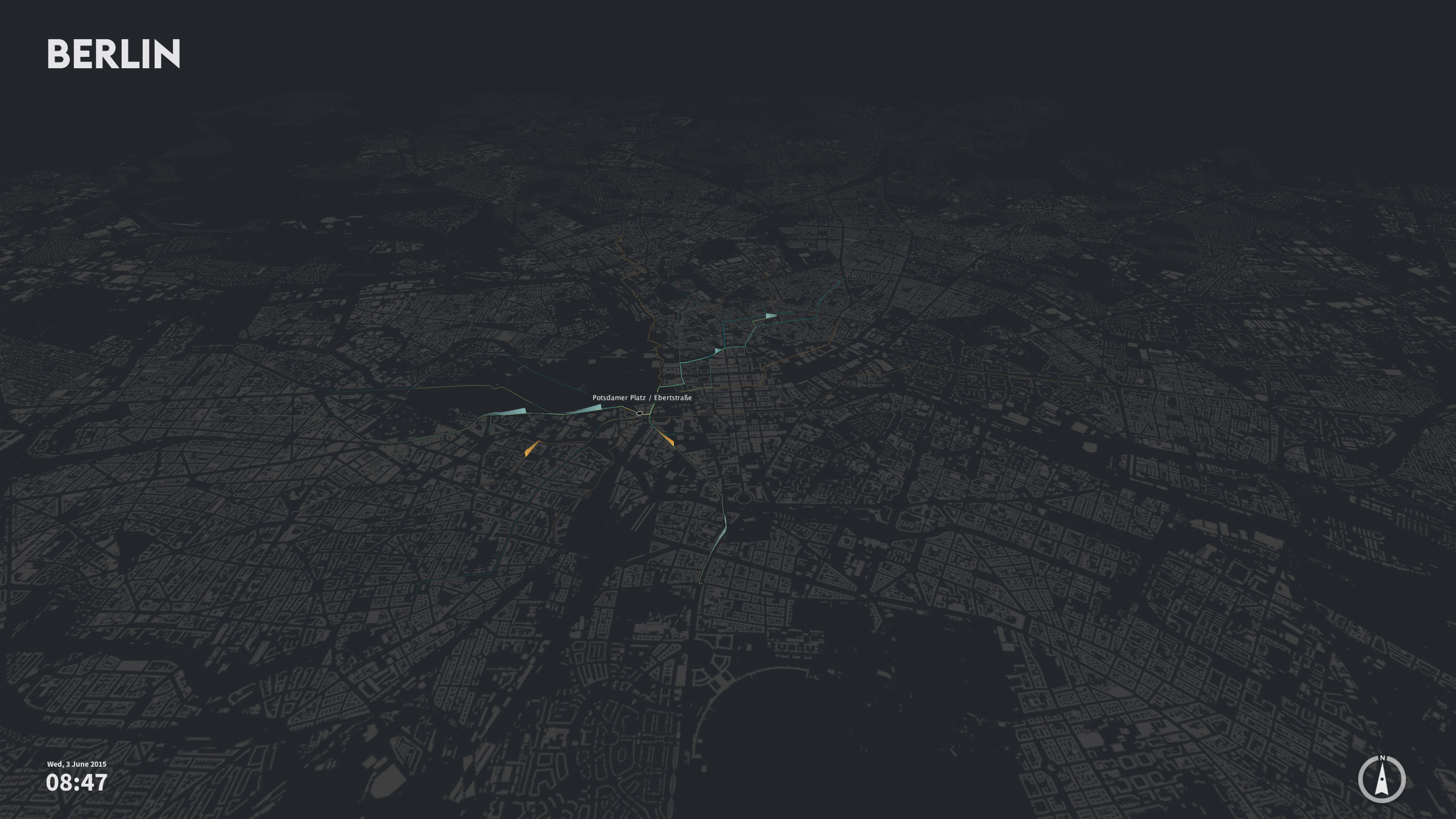
Trajectories of all bike trips within a given time frame are animated on top of the background map. Underneath, all bike trips of the day are displayed as thinner, lighter paths in order to give a subtle impression of the whole space of flows and to allow comparing the current activity with the overall bike-sharing network.
Trails are used to visualize the bike trips underway at the currently selected time. The trails are rendered in what we call a firefly style with the current position shown as the brightest and the previous ones fading, resembling how a moving light source appears in a long exposure photo.
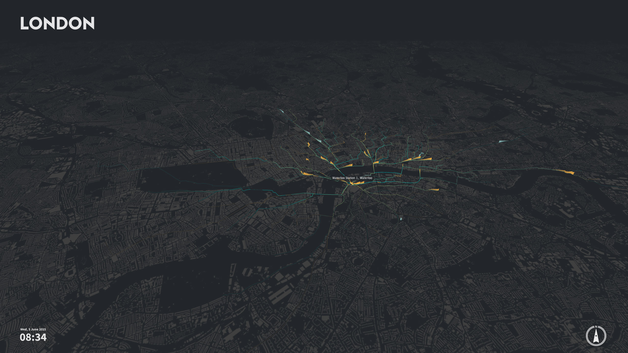
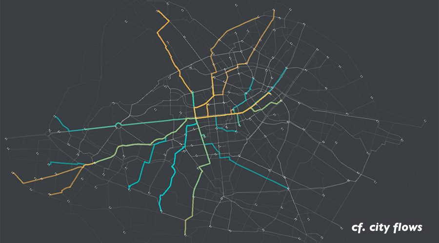
Trips to and from a selected station are displayed on the map. For each city, a station with high activity throughout the day is highlighted and its name displayed. By selecting a single station we can distinguish the directionality of bike trips via color coding and closely observe changing ratios between incoming and outgoing trips.
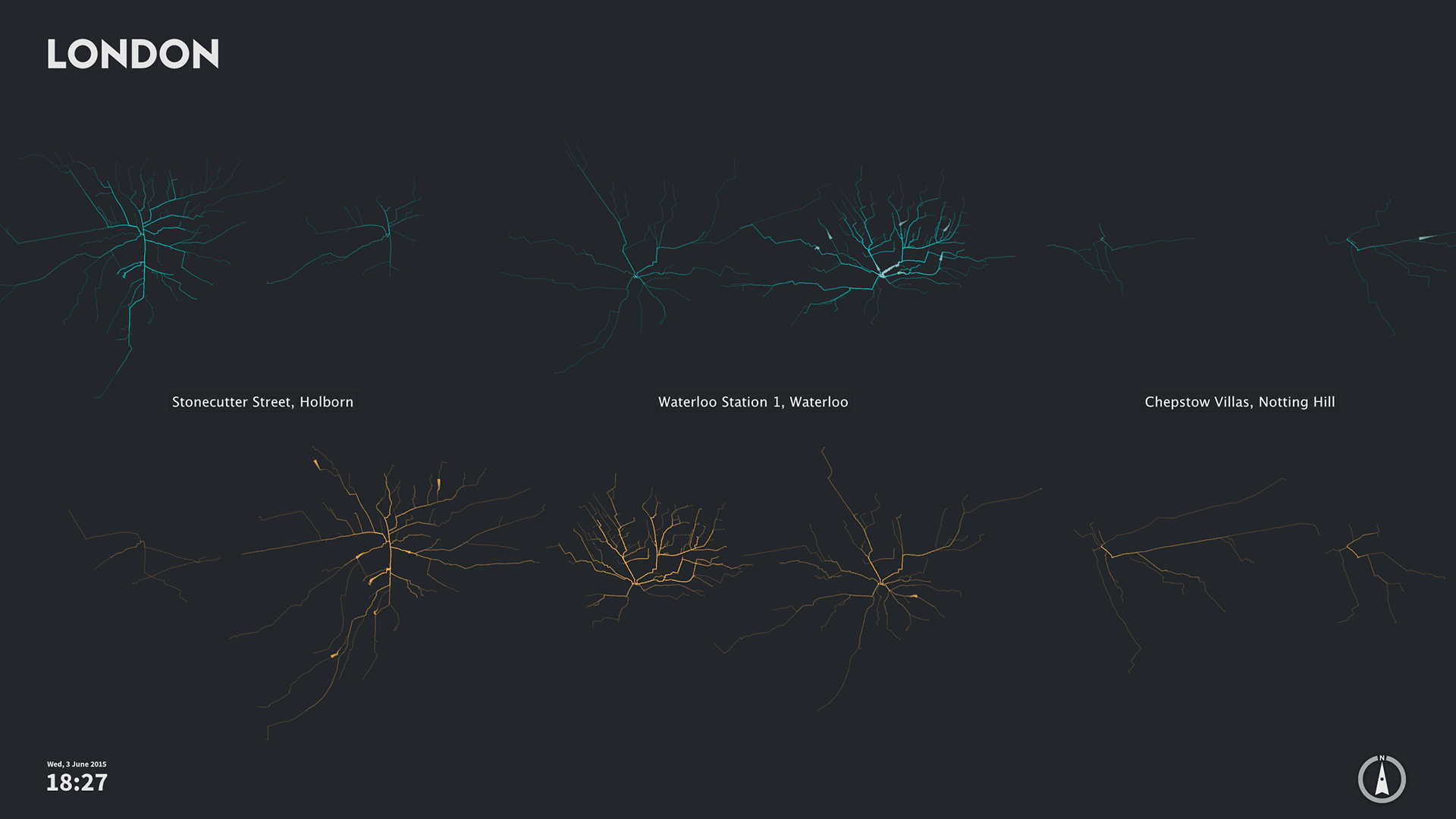
Thanks to the color mapping and the fewer shown trips, this view reveals more specific spatiotemporal patterns. In London, for instance, many trips start at Waterloo Station in the morning, which hints to the commuters arriving by public transit at the train station and cycling to their workplaces.
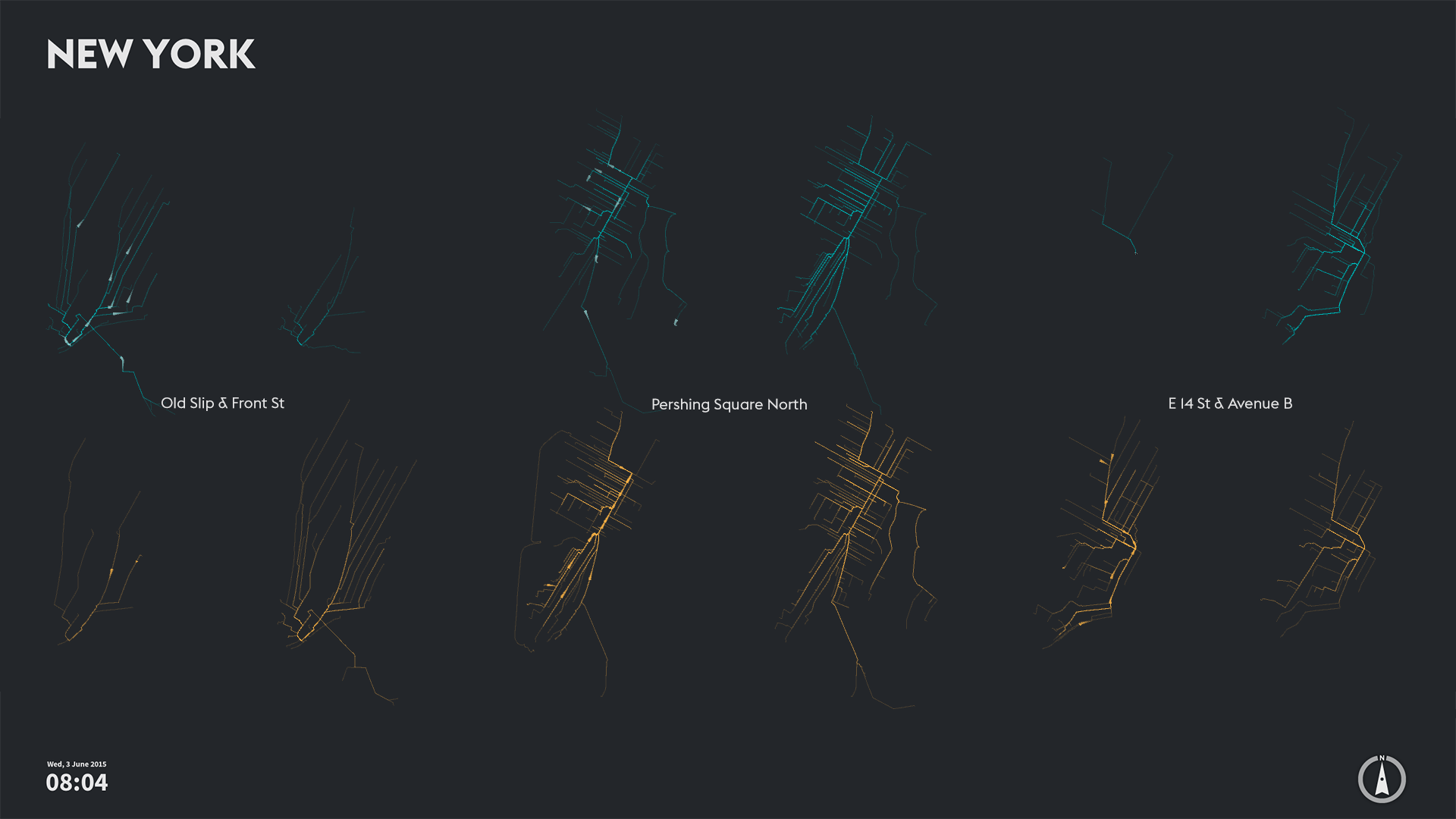
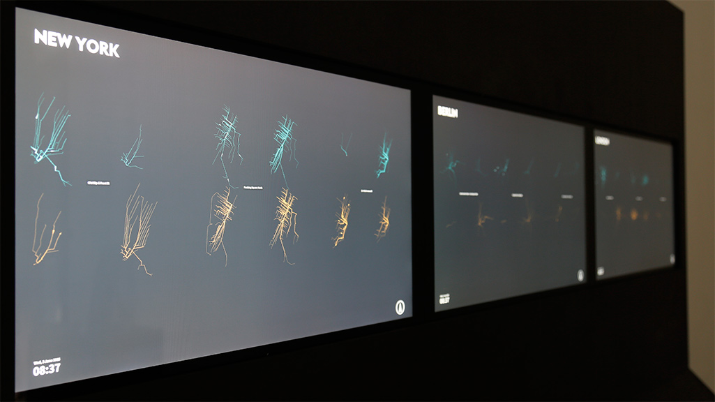
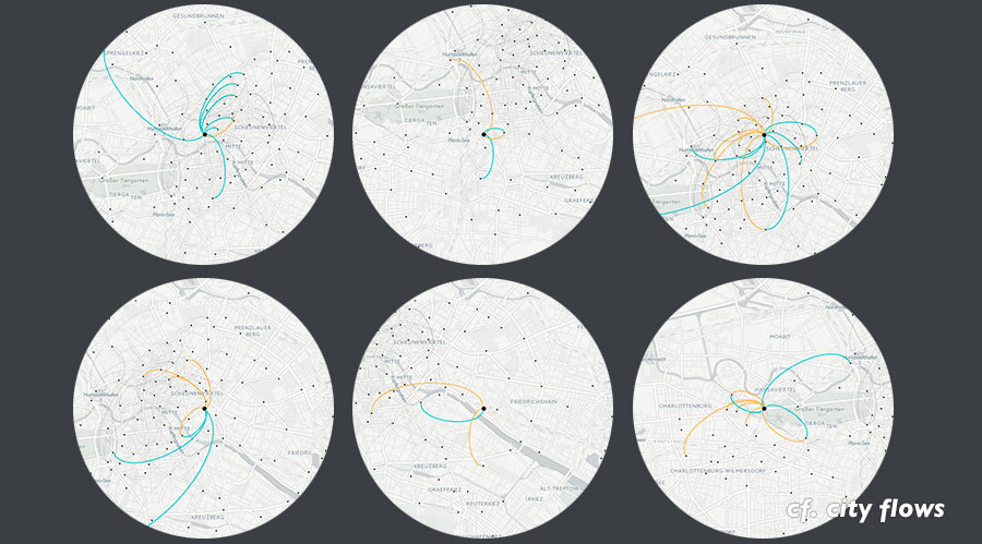
A detailed perspective on the activity of three bike stations per city is presented by featuring an arrangement of small multiples. The bike trips for a selected bike station are separated into four glyphs by directionality and temporality and set in a two-by-two grid.
All trips to that station are displayed in the upper row and all trips from that station in the lower row.
All trips in the morning are aggregated in the left column and all trips in the evening in the right column.
For each city, this view shows urban fingerprints for three stations with different bike-sharing properties. They can reveal spatiotemporal mobility patterns, such as commuters arriving to an office district in the morning and leaving the area in the evening (see station "Old Slip & Front St" in Lower Manhattan). In comparison with the small multiples on the right, more trips begin in the morning and end in the evening, which might indicate a residential or leisure area (see "E 14 St & Avenue B" close to Stuyvesant Town, a large residential complex).
The interaction with the visualization is provided via a tablet embedded in a plinth at about one meter distance to the display wall. A dashboard on the tablet shows further details about the bike-sharing systems such as the total number of stations, bikes, and trips as well as morning and evening trips per city. The temporal fluctuation of trips over the day is displayed as a horizon chart.
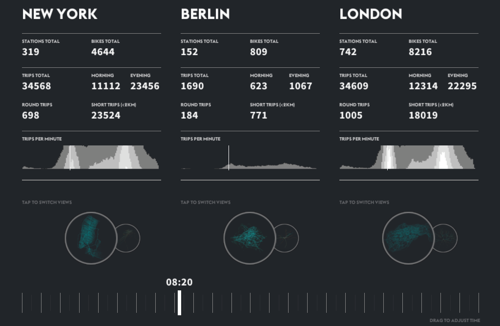
Below the city details, users can switch between the views by tapping on one of the circular buttons. The buttons only allow for discrete steps in order to follow the deliberate sequence between the three views. At the bottom of the dashboard, an interactive time slider shows the current time, and allows visitors to select any time of day directly. Each temporal selection is reflected in all screens instantaneously.
Watch all viewing modes for each of the cities.
Basic spatiotemporal patterns in individual cities quickly become visible. Visitors in our exhibition pointed out major spatial patterns, such as the barrier between Middle Manhattan and Central Park, or the inner city area in Berlin. Similarly, several people noted the apparent differences between New York’s grid street plan in contrast to the idiosyncratic street layouts of the historically grown cities Berlin and London.
Many people observed the vastly different numbers of journeys in Berlin compared to London and New York City. While cycling indeed is more common in Berlin than in London, Berlin’s bike-sharing scheme is mostly used for tourist and leisure activities, as most riders have their own bikes.
The small multiple view allows for detailed intra- and intercity comparisons. Viewers can see similarities and differences between stations of one city and between stations of different cities. While cities all have their own character, many have comparable functional units of urban mobility.
cf. city flows is a visualization for citizens to engage with the spatiotemporal complexity of urban mobility and compare their city with others.
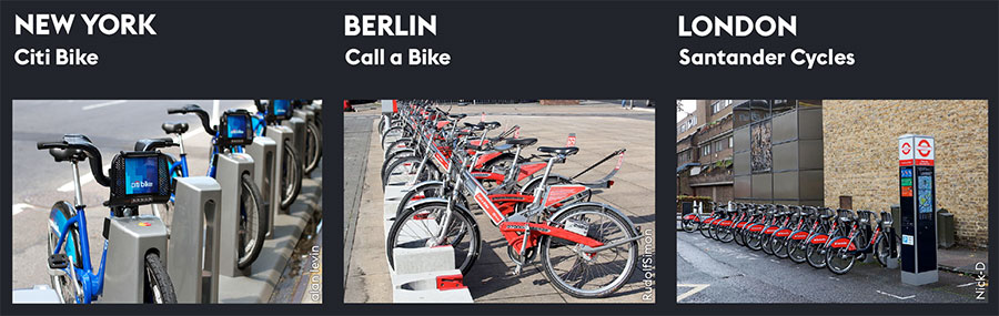
For each city, we mapped journeys of its public bike-sharing system. In recent years, with transport authorities and companies beginning to understand the value of open data, more and more bike-sharing providers publish some of the system’s data. This ranges from basic data such as number and locations of stations, to available bikes, to journeys between stations. While the first two are abundant, only few providers share trip data. From these bike-sharing providers we selected the bike-sharing systems of New York City and London. We also added Berlin, although trip data had not yet been published when we developed our project. We scraped the data from a real-time map that displays available bikes and contains IDs for each bike. Thus, we could derive trip data based on the assumption that a trip started as soon as a bike is removed from the map and ends once it re-appears later at another station (potentially including non-trip bike movements, e.g. for re-balancing purposes).
The chosen systems do not include route information since the bike systems do not provide GPS tracked movements (for cost and privacy reasons). We used the locations of the journey’s start and end stations to calculate optimal paths via HERE’s routing service.
The background map’s main purpose is to give visitors a quick overview of the city and provide the backdrop for the bike-sharing visualizations. The design of the basemaps are inspired by the historic Nolli map, containing a figure/ground distinction between private and public areas. For all three cities we used the most precise building data available, with the UK making its data open just before the launch of our visualization.
Throughout our exploratory design process we created a range of visual experiments in order to dig into the bike data, find and highlight interesting patterns, and select appropriate mappings and visualizations. Some of those we share below.

The slides of our talk below show our design concept, the exhibition setup, and samples of the visualizations we developed throughout the process.
Click/Tap on an image to see it in high-resolution.
Nagel, T., Pietsch, C., Dörk, M. Staged Analysis: From Evocative to Comparative Visualizations of Urban Mobility. In Proceedings of the IEEE VIS Arts Program, VISAP, October 2016, pages 23-30 (PDF)
A selection of media featuring cf. city flows:
We wish to thank our colleagues from the Urban Complexity Lab for all their support and feedback. We especially thank Samira Akhavan, Andrea Biedermann, and Christian Münch for designing and constructing the exhibit furniture. This work was supported in part by HERE.
Besides for city flows, cf. also stands for confer (latin), resulting in a meaning of: compare the flows of different cities.