About the Project
Concept and Approach
ARETE is a project of the UCLAB at the University of Applied Sciences Potsdam. The central result of the project is the interactive visualization of the history of the Latin alphabet. In particular, the visualization shows the temporal and formal relationships of the different scripts and typefaces to each other.
Our main concern was to show the diversity and variance of the Latin alphabet over the centuries. It is often suggested that the Roman Capitalis evolved to Antiqua scripts to today's Grotesk in a linear way. However, we believe that this is only one possible view among many. Like any cultural development, the history of type and script is, at its core, a network. Over the centuries, designers have learned from others, referred to existing designs, and developed variants. There were times of greater standardization and then again times of great variance. The Arete project wants to show and clarify this diversity and these different design lines.
Another concern was to show not only the typographic history, but also the history of calligraphy and handwriting. Even after the invention of printing, a lot of text production occurred by hand. In the 17th and 18th centuries, various social, economic and cultural developments even caused handwriting to flourish.
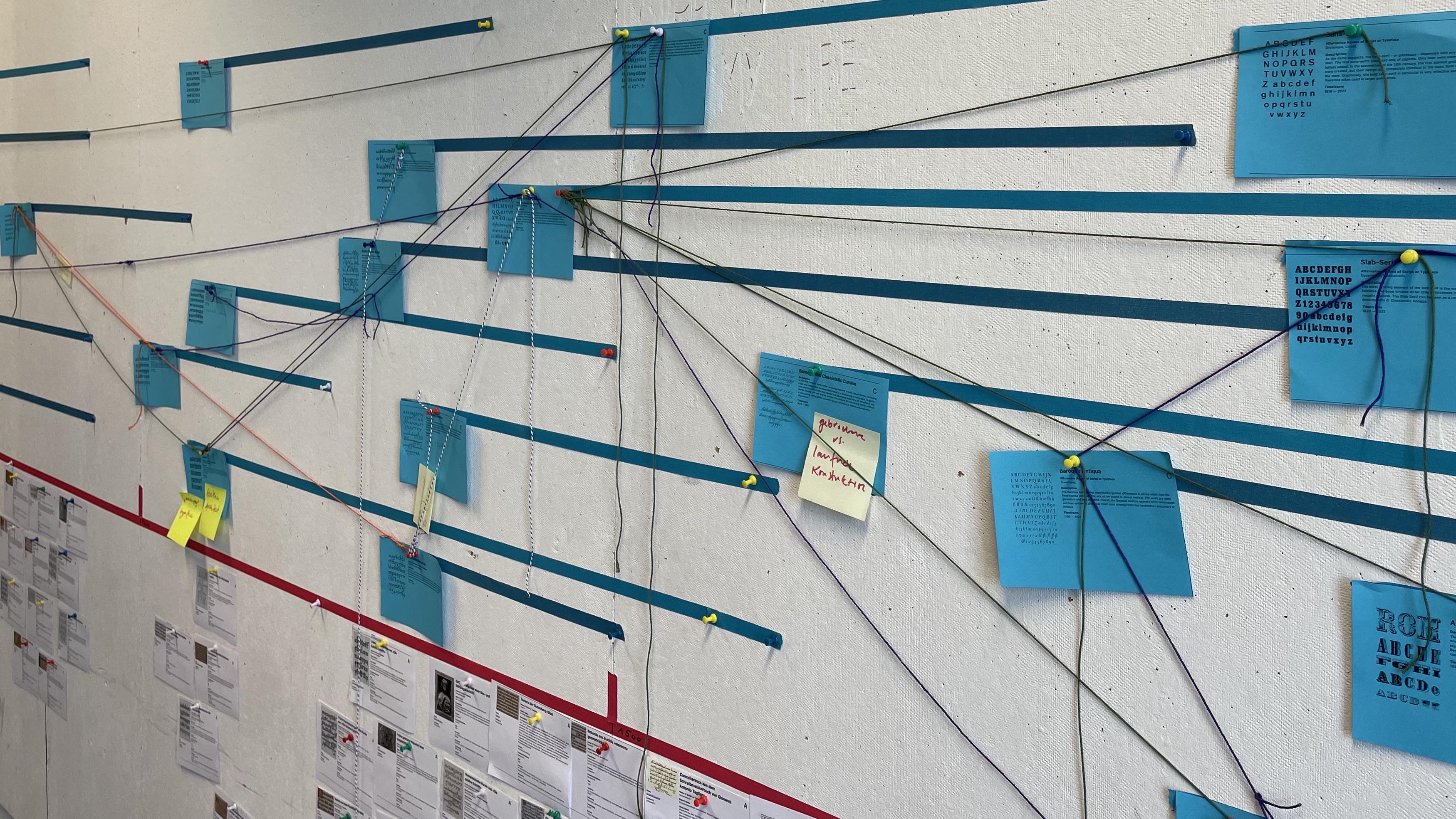
In order to be able to structure and convey the historical development, we have used classifications. These “classes” stand for certain, historically describable expressions of the Latin alphabet. The development of this class system is based on existing literature. In particular, the books “Die schöne Schrift” by František Muzika, “Schriftkunst” by Albert Kapr and “Bruckmann’s Handbuch der Schrift” by Erhardt D. Stiebner and Walter Leonhard were decisive for this.
It is important for us to emphasize that this classification system is only used to illustrate the historical developments. It is not intended to represent an attempt to organize the currently available typeface inventory. The font designer Gerrit Noordzij has expressed a relevant criticism of the traditional classification system in his book “The Stroke”. As an alternative, he proposes a very plausible system based only on the variance of the stroke. However, the use of classes is necessary for describing historical developments.
Each class is assigned a number of representative examples. The selection of examples is intended to show the most important characteristics of the respective script or typeface. Here, too, it becomes clear that some classes exhibit an high degree of variance, while others have a high degree of similarity among themselves.
In order to better classify the different scripts and typefaces, a timeline with events from society, technology and culture is located on the left side of the visualization. These events offer orientation and provide a general historical framework. The visualization offers a visual, non-linear and explorative approach to the history of the Latin alphabet.
We would like to emphasize that the project in this form is not yet complete. Rather, it is a first attempt to bring the history of the Latin alphabet into a visual, interconnected structure and to present the major historical developments in a clear and evocative way.
The History of the Latin Alphabet
It is surprising that the history of writing and printing plays only a minor role in academic discourse. Compared to the fact that writing and reading is a fundamental cultural technique, relatively little research and publications exists on the culture and history of writing and printing.
The ARETE project is an attempt to describe the formal development of the Latin alphabet throught the centuries. This is not meant to exclude other writing systems - there were intense discussions within the project as to whether, for example, archaic Greek should be included in the visualization. Ultimately, however, our aim is to show the evolution and the wealth of forms of an apparently standardized writing system.
Typography and calligraphy in particular deal with the history of type and script. Both disciplines have a very specific view of the historical process. Typography sees all typeface developments before Gutenberg as a direct progression to typesetting: the Roman capitalis becomes our capital letters, the Carolingian minuscule our lowercase letters. The typographically influenced view often suggests a linear development from protosinaitic script to Latin capital letters. The glyph for “ox” becomes a printed A.
Calligraphy, on the other hand, tries to distinguish itself from both typography and simple handwriting, emphasizing in particular the line of tradition of the medieval illuminated codex. Obviously, both disciplines have their specific historical lines and points of view, emphasizing the differences rather than the similarities. There are hardly any approaches that attempt to synthezise the historic developments of typography, calligraphy, and handwriting in one system.
František Muzika, a Czech artist and graphic designer, comes closest to showing the connections and historical lines between different letter forms. His book “Die Schöne Schrift” contains a very large fund of historical typeface developments. He also clearly shows that there were parallel developments and that certain forms of type production were in use far longer than is often assumed. Even after the invention of printing, books were still written and illuminated by hand for centuries.
In recent years, the use of type has changed significantly through digital technology. Individual type production is no longer limited to handwriting, but takes place primarily in a digital context with the help of various software systems and very different fonts. Since many historical scripts have also found their way into digital systems, it makes sense to provide the general public with a better understanding of the history of type and script. At the same time, the cultivation of handwriting and calligraphy is currently experiencing a renaissance – presumably also as a countermovement to digital type production. Also in this context, it is important to point out the historical relationships and connections between calligraphy and typography.
It is obvious that we need to develop a contextual, non-linear understanding of the history of type and script. Such a synthetic approach offers a rich and insightful presentation of design history.
Team & Workshop
Team FHP: Prof. Boris Müller (project lead), Jonas Pelzer (design and technical implementation), Ayse Nacak (research und design), Elsa Woelk (research)
Experts: Sybille van Zuylen, Erik Spiekermann, Lucas de Groot, Stefanie Weigele
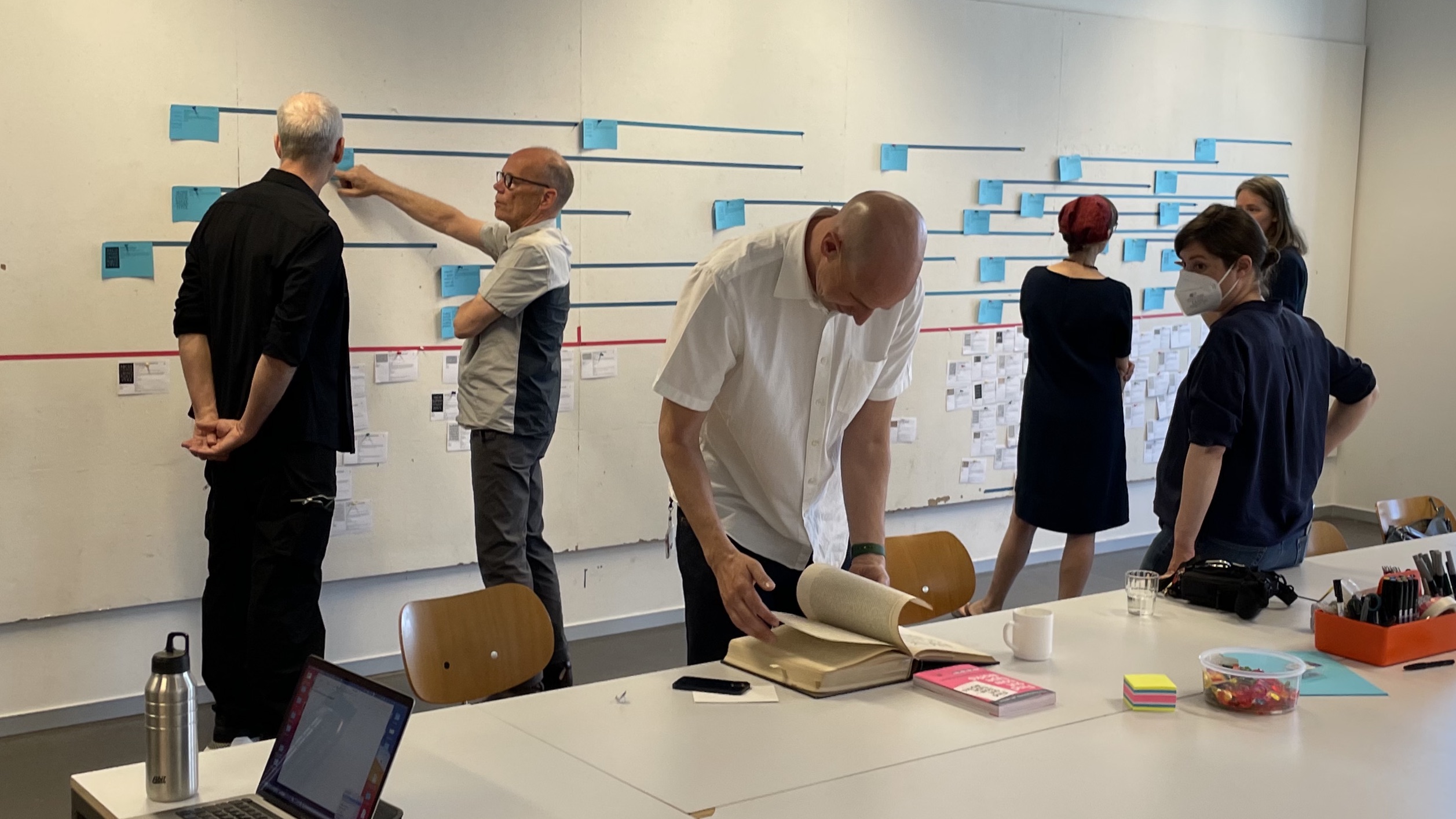
On June 17, 2022, an all-day expert workshop was held at the FH Potsdam, where the overall concept and the visualization was discussed and developed with the aforementioned experts. The results of the workshop are the basis for the structure of the visualization.
References
- Bertram, Axel. Das wohltemperierte Alphabet: eine Kulturgeschichte. Leipzig: Faber & Faber, 2005.
- Bringhurst, Robert. The Elements of Typographic Style: Point Roberts: Hartley & Marks, Publishers, 1997.
- Catich, Edward M.. The Origin of the Serif: Brush Writing & Roman Letters. Davenport: Catich Gallery, St. Ambrose University, 1991.
- Clayton, Ewan. The Golden Thread: The Story of Writing. London: Atlantic Books Ltd, 2013.
- Haarmann, Harald. Universalgeschichte der Schrift: Frankfurt am Main: Zweitausendeins, 2004.
- Harris, David. Die Kunst des Schreibens: eine Anleitung zur Kalligraphie. München: Coventgarden, 2008.
- Kapr, Albert. Schriftkunst: Geschichte, Anatomie und Schönheit der lateinischen Buchstaben. München: K.G. Saur, 1981.
- Kupferschmid, Indra. Buchstaben kommen selten allein: ein typografisches Handbuch. Sulgen: Niggli, 2003.
- Lovett, Patricia. The Art and History of Calligraphy: . London: British Library, 2020.
- Morison, Stanley. Stanley Morison : Selected Essays on the History of Letter-forms in Manuscript and Print: . Cambridge: Cambridge University Press, 1981.
- Morison, Stanley. Typenformen der Vergangenheit und Neuzeit: . Hellerau: Demeter Verlag, 1928.
- Muzika, František. Die schöne Schrift in der Entwicklung des lateinischen Alphabets: Prag: Artia, 1965.
- Nerdinger, Eugen. Buchstabenbuch: Schriftentwicklung, Formbedingungen, Schrifttechnik, Schriftsammlung. München: Callwey, 1954.
- Noordzij, Gerrit. The Stroke: Theory of Writing. New York: Princeton Architectural Press, 2006.
- Shaw, Paul. The Eternal Letter: Two Millennia of the Classical Roman Capital. Cambridge: MIT Press, 2015.
- Stiebner, Erhardt D., Leonhard, Walter. Bruckmann’s Handbuch der Schrift: . München: Bruckmann, 1977.
A central resource for 20th century typefaces was Prof. Michael Wörgötter’s digitised Typeface Index, which he made available via the Letterform Archive.
Funding
The ARETE project was funded by the Innovation Fund of the University of Applied Sciences Potsdam.