Marian Dörk Information Visualization
Marian is a research professor for Information Visualization & Management at the Design Department and Urban Futures Institute of the University of Applied Sciences Potsdam. He offers courses for students of interface design, urban futures, and the information sciences.

After completing his studies in Computational Visualistics (Dipl.-Ing.) at the Otto-von-Guericke University Magdeburg (2003-2008), Marian Dörk did his doctorate on visualization for information seeking at the University of Calgary in Canada (2008-2012). During his years as a PhD student, he had the opportunity to collaborate with reseachers and engineers at Google, Microsoft and IBM. Afterwards he spent a year as a postdoctoral researcher at Newcastle University, UK (2012-2013), researching visualizations for playful access to networked data sets and unstructured text data.
Marian Dörk’s research activities focus on information visualization with a particular sensitivity towards social, cultural and technological transformations. From 2014 to 2017, he led the BMBF project »Visualizing Cultural Collections« (VIKUS), which was followed by numerous collaborative projects with cultural institutions and research institutes. Marian is interested in novel uses of information visualization to support a wide range of data practices especially in the context of cultural collections and urban transformations.
Projects Contributions
 Project
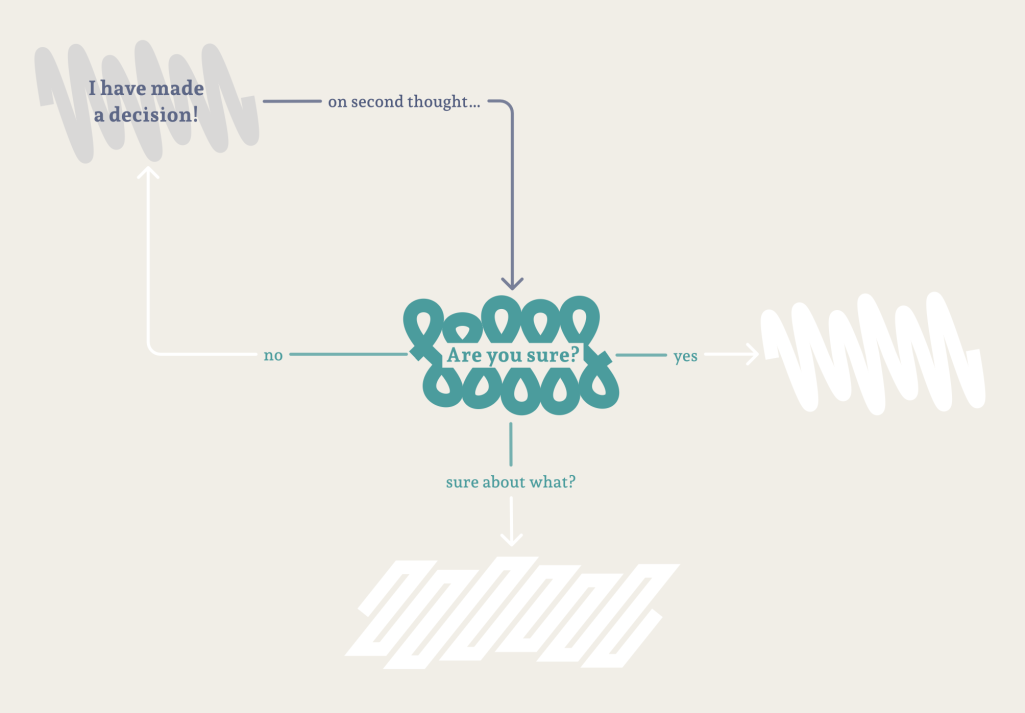
Interactive Flowchart
Navigating and Narrating Complexity through Exploration and Storytelling
 Project
GraDiM
Granularities of dispersion and materiality: Visualizing a photo archive about diaspora
 Project
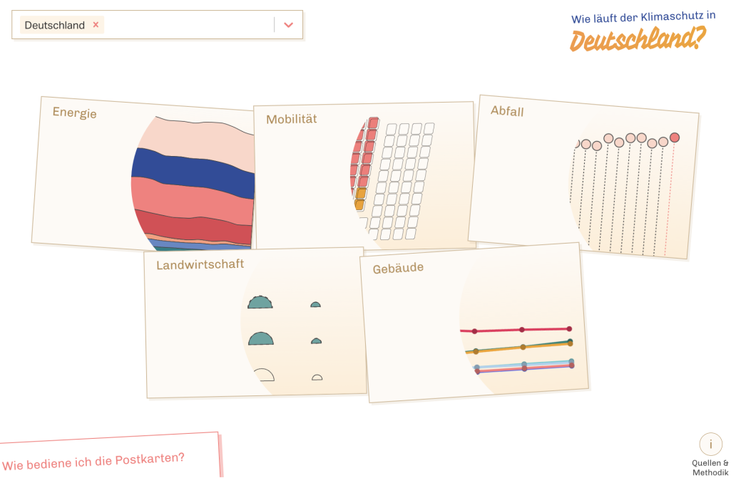
Klimakarten
From shock to shift
 Project
Amazonia Future Lab
Connect – Comprehend – Communicate
 Project
RESTAGING FASHION
Digital contextualization of vestimentary sources
 Project
Intervis
Inter...what? Intersectionality! A visual introduction
 Project
The Fold
Rethinking interactivity in data visualization
 Project
A Visual Exploration
… of two museum collections
 Project
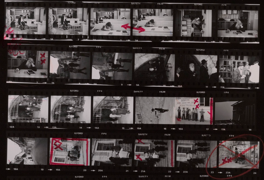
Topography of Violence
Visualizing antisemitic violence in Germany 1930–1938
 Project
Visuals for Language
Consistent visual representations of grammar
 Project
KOLLISIONEN
Media collisions as drivers of innovation for new approaches to cultural heritage
 Project
VIDAN
Visual and dynamic arrangements of narratives
 Project
SoNAR (IDH)
Interfaces to data for historical social network analysis and research
 Project
Close-Up Cloud
Gaining a sense of overview from many details
 Project
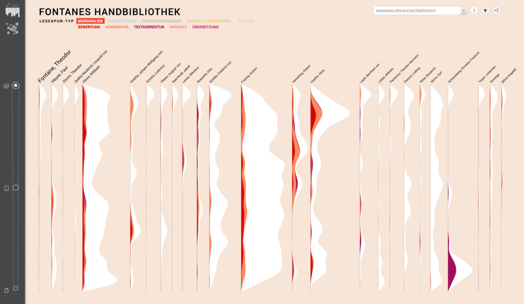
Reading traces
Visualizing Fontane’s reference library
 Project
INFORMATION+ 2018
International conference on information design & visualization in Potsdam
 Project
VIKUS Viewer
Explore cultural collections along time, texture and themes
 Project
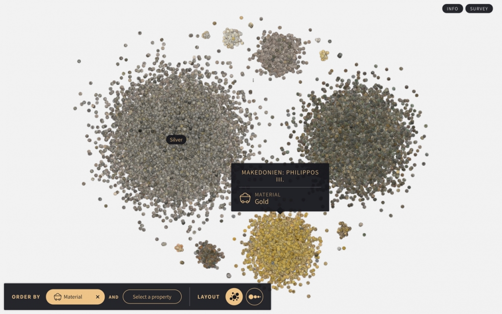
Coins
Visualizing a numismatic collection as heaps, streams, and plots
 Project
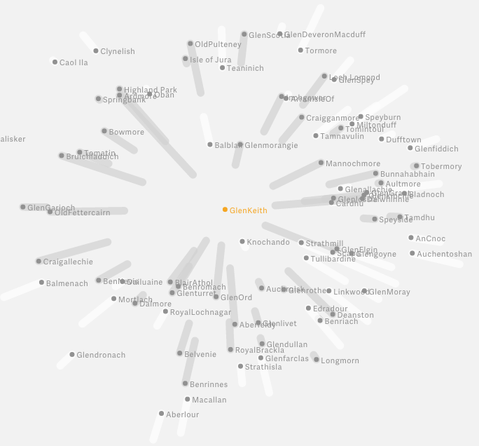
DNBVIS
Visualization of bibliographic data and content
 Project
GEI-Digital Visualized
Visualizing a digital library of historical textbooks
 Project
Memory Dialogue
Exploring artefact-based memory sharing
 Project
Reverse information architecture
How is exploration manifested in online collections of museums?
 Project
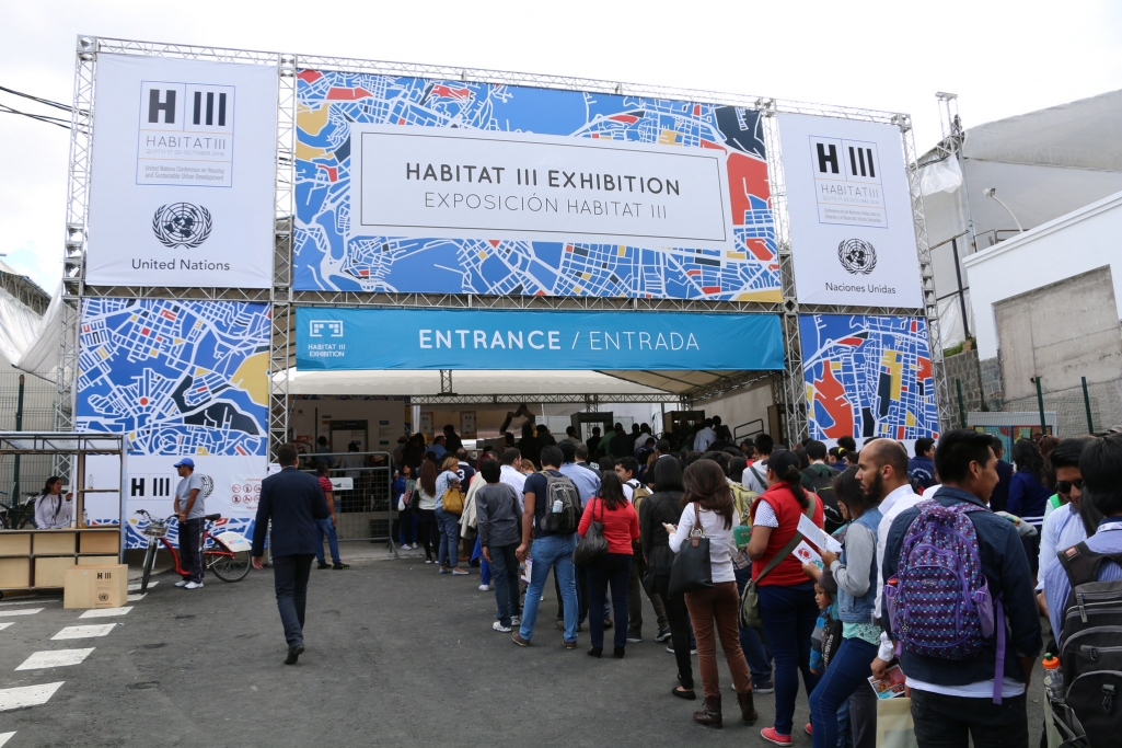
Habitat X Change
Science meets visualization for sustainable urban futures
 Project
VisTent
Visualizing urban data using top-projected city models
 Project
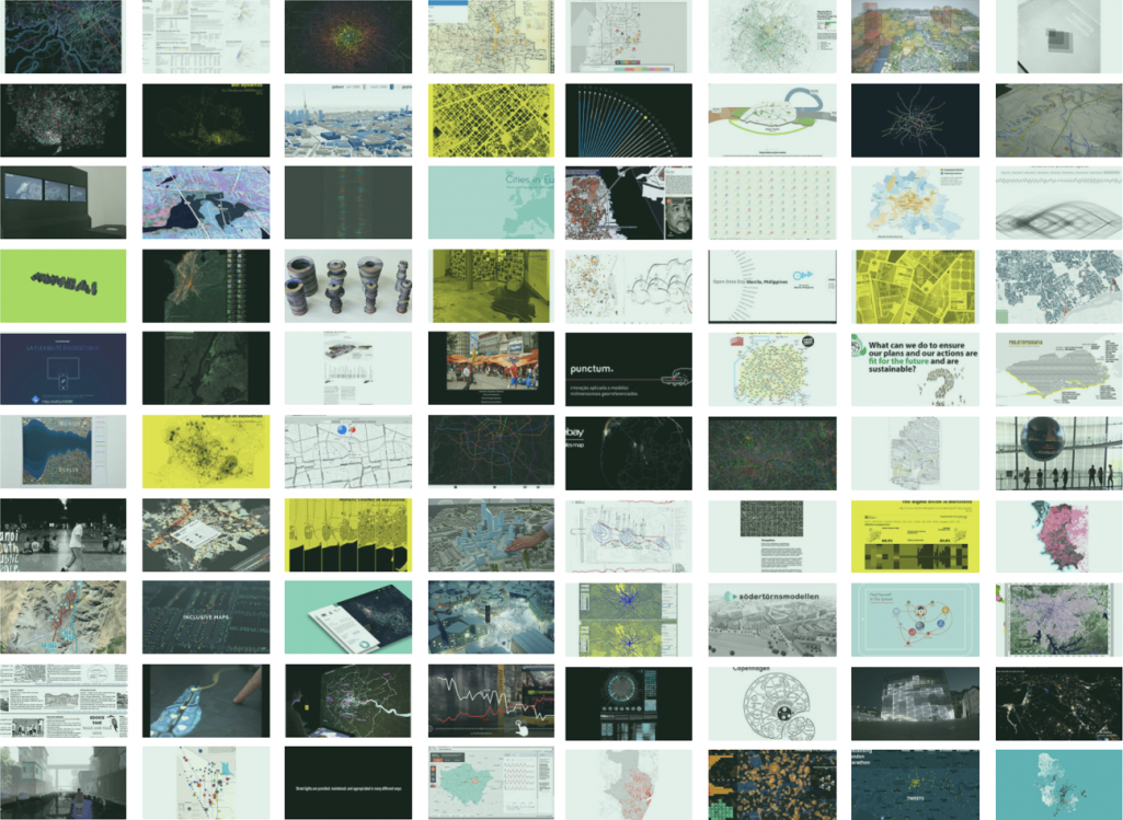
Visualizing Cities
An open platform for urban visualization projects
 Project
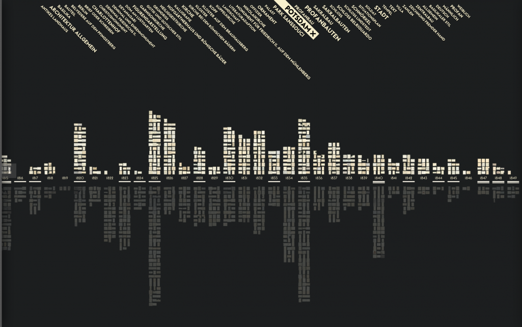
PAST VISIONS
penned by Frederick William IV
 Project
Shifted Maps
Revealing networks in personal movement data
 Project
Probing Projections
Interaction techniques for interpreting dimensionality reductions
 Project
Micro Visualisations
How can visualisations enhance typography?
 Project
VIKUS
Visualizing Cultural Collections
 Project
Culturegraphy
Visualizing cultural network dynamics
 Project
Deutsche Digitale Bibliothek visualisiert
How does a cultural collection of over 7 million objects look like?
 Project
Monadic Exploration
Seeing the whole through its parts
 Project
WordWanderer
Take your text for a walk
Publications Published Works
Tracing and Telling: Exploring collection holdings through graph-based narratives
Cultural collections have transcended the boundaries of physical showcases and storage cabinets, evolving into intricate digital webs of interconnected data. The research project Restaging Fashion aimed to expand the possibilities for experiencing the linkages in digitized cultural heritage, focusing on the visualization of collection holdings related to the history of garments. Through graph-based narratives, the project investigated the complex interplay between the linear – and at times tentative – art historical discourses and the non-linear explorations of associated cultural heritage data. The resulting visualizations have been designed with the aim to allow for curated and dynamic exploration of the collection along research essays and their interrelated graphs.
From shock to shift: Data visualization for constructive climate journalism
We present a multi-dimensional, multi-level, and multi-channel approach to data visualization for the purpose of constructive climate journalism. Data visualization has assumed a central role in environmental journalism and is often used in data stories to convey the dramatic consequences of climate change and other ecological crises. However, the emphasis on the catastrophic impacts of climate change tends to induce feelings of fear, anxiety, and apathy in readers. Climate mitigation, adaptation, and protection—all highly urgent in the face of the climate crisis—are at risk of being overlooked. These topics are more difficult to communicate as they are hard to convey on varying levels of locality, involve multiple interconnected sectors, and need to be mediated across various channels from the printed newspaper to social media platforms. So far, there has been little research on data visualization to enhance affective engagement with data about climate protection as part of solution-oriented reporting of climate change. With this research we characterize the unique challenges of constructive climate journalism for data visualization and share findings from a research and design study in collaboration with a national newspaper in Germany. Using the affordances and aesthetics of travel postcards, we present Klimakarten, a data journalism project on the progress of climate protection at multiple spatial scales (from national to local), across five key sectors (agriculture, buildings, energy, mobility, and waste), and for print and online use. The findings from quantitative and qualitative analysis of reader feedback confirm our overall approach and suggest implications for future work.
A Contemporary Nolli Map: Using OpenStreetMap Data to Represent Urban Public Spaces
More than 250 years ago, Giovanni Battista Nolli, an Italian architect, engineer and cartographer, was concerned with how and where space is or is not publicly accessible. In his map ‘La nuova topografia di Roma Comasco’, he mapped publicly accessible interior and exterior spaces of Rome with an impressively high level of detail as a figure-ground map. Since Nolli’s time, both the character and diversity of public spaces as well as cartographic technology have changed. This research project aims to adapt some ideas behind Nolli’s map for today’s circumstances on the basis of open data, and seeks to develop methods for processing volunteered geographical information from OpenStreetMap (OSM) to identify, categorize, and map public spaces based on thematic and geometric information.
“The research is happening in the text fields” – Are Linked Open Data and Art History a good match?
This contribution explores the instructive tensions between art-historical research and semantic data modeling. While the potential of LOD-applications is obvious in terms of standardization and precision some aspects of research may not be formally represented. Therefore we propose to bridge LOD and full text descriptions through information visualization.
Data Stories of Water: Studying the Communicative Role of Data Visualizations within Long-form Journalism
Unfolding Edges: Adding Context to Edges in Multivariate Graph Visualization
Existing work on visualizing multivariate graphs is primarily concerned with representing the attributes of nodes. Even though edges are the constitutive elements of networks, there have been only few attempts to visualize attributes of edges. In this work, we focus on the critical importance of edge attributes for interpreting network visualizations and building trust in the underlying data. We propose ‘unfolding of edges’ as an interactive approach to integrate multivariate edge attributes dynamically into existing node-link diagrams. Unfolding edges is an in-situ approach that gradually transforms basic links into detailed representations of the associated edge attributes. This approach extends focus+context, semantic zoom, and animated transitions for network visualizations to accommodate edge details on-demand without cluttering the overall graph layout. We explore the design space for the unfolding of edges, which covers aspects of making space for the unfolding, of actually representing the edge context, and of navigating between edges. To demonstrate the utility of our approach, we present two case studies in the context of historical network analysis and computational social science. For these, web-based prototypes were implemented based on which we conducted interviews with domain experts. The experts’ feedback suggests that the proposed unfolding of edges is a useful tool for exploring rich edge information of multivariate graphs.
Attitudinal effects of data visualizations and illustrations in data stories
Journalism has become more data-driven and inherently visual in recent years. Photographs, illustrations, infographics, data visualizations, and general images help convey complex topics to a wide audience. The way that visual artifacts influence how readers form an opinion beyond the text is an important issue to research, but there are few works about this topic. In this context, we research the persuasive, emotional and memorable dimensions of data visualizations and illustrations in journalistic storytelling for long-form articles. We conducted a user study and compared the effects which data visualizations and illustrations have on changing attitude towards a presented topic. While visual representations are usually studied along one dimension, in this experimental study, we explore the effects on readers’ attitudes along three: persuasion, emotion, and information retention. By comparing different versions of the same article, we observe how attitudes differ based on the visual stimuli present, and how they are perceived when combined. Results indicate that the narrative using only data visualization elicits a stronger emotional impact than illustration-only visual support, as well as a significant change in the initial attitude about the topic. Our findings contribute to a growing body of literature on how visual artifacts may be used to inform and influence public opinion and debate. We present ideas for future work to generalize the results beyond the domain studied, the water crisis.
Sensing What’s New: Considering Ethics When Using Sensor Data in Journalistic Practices
As data are becoming increasingly central to journalistic practice, a number of technology-driven approaches are emerging among data journalists. This article focuses on sensor journalism, which brings new practical and ethical concerns to journalism. By interviewing and working with data journalists and journalism scholars, we analyze the new technological and ethical challenges that sensors bring to journalism. The results contribute to the knowledge on how data journalists implicitly embed ethical values into their everyday work. Furthermore, they suggest that general ethical values are revisited and extended by the influence of sensors.
Disclosure as a critical-feminist design practice for Web-based data stories
Data Montage: Towards Coherence in Multimodal Data Representation
Drawing from the history of theatre and cinema, we present theoretical research on multi-modal data representations, such as sonifications, edibilizations, olfactations, and physicalizations. We contribute to digital humanities by translating montage of attraction to multimodal data representation and reflect on how the careful combination of modal variables can contribute to the coherence and emotional impact of multimodal interfaces.
Graph Technologies for the Analysis of Historical Social Networks Using Heterogeneous Data Sources
Over the last decades, cultural heritage institutions have provided extensive machine-readable data, such as bibliographic and archival metadata, full-text collections, and authority records containing multitudes of implicit and explicit statements about the social relations between various types of entities. In this paper, we discuss how approaches to the creation and operation of advanced research infrastructure for historical network analysis (HNA) based on heterogeneous data sources from cultural heritage institutions can be examined and evaluated. Based on our interdisciplinary research, we describe challenges and strategies with a special focus on the issue of data processing, sketch out the advantages of human-centered project design in the form of a preliminary co-design workshop, and present an iterative approach to data visualization.
Was sehe ich? Visualisierungsstrategien für Datentransparenz in der Historischen Netzwerkanalyse
Die Historische Netzwerkanalyse (HNA) hat sich zu einem etablierten Forschungsfeld entwickelt. Zu ihren wichtigsten methodischen Herausforderungen gehört die Suggestionskraft von Visualisierungen. Die Transparenz bezüglich der Datenquellen ist daher für die HNA sowohl bei selbst erhobenen als auch bei sekundär genutzten Daten Voraussetzung, will sie geisteswissenschaftlichen Kriterien der Nachprüfbarkeit und Nachvollziehbarkeit von Interpretationen erfüllen. Dieser Beitrag beschreibt und diskutiert – aufbauend auf einem iterativen und durch Workshops sowie einer Nutzer*innenstudie begleiteten Forschungsprozess – vier Designziele zur Verwirklichung einer solchen Transparenz: 1) Aufnahme und Kommunikation von Datenprovenienzen, 2) Dokumentation vorausgegangener Prozesse, 3) Offenhaltung der Interpretierbarkeit der Daten und 4) Unterstützung von Folgeforschung. Anschließend werden beispielhafte Umsetzungsstrategien in Form von Prototypen präsentiert.
Von der Wolke zum Pfad: Visuelle und assoziative Exploration zweier kultureller Sammlungen
Die in den letzten Jahren entstandenen explorativen Visualisierungen musealer Sammlungen widmen sich zumeist einzelnen Sammlungen, welche oft einer spezifischen Systematik folgen und eine geringe Vielfalt an Objektgattungen und Attributen aufweisen. Das hier vorgestellte Forschungsprojekt stellte sich die Frage, wie verschiedene, in sich heterogene, Sammlungen miteinander verknüpft, visualisiert und exploriert werden können, ohne die Unterschiede zwischen ihnen zu nivellieren. Dazu wurden im Rahmen einer Forschungskooperation mit den Staatlichen Museen zu Berlin die Bestände aus dem 19. Jahrhundert der Alten Nationalgalerie sowie des Museums Europäischer Kulturen ausgewählt. Das Ziel war es, übergreifende Zusammenhänge und Resonanzen zwischen den Sammlungen aufzugreifen und dynamische, interaktive Arrangements zu entwickeln, welche die assoziative Exploration von Beständen anregen. Das Ergebnis ist ein interaktiver Prototyp, der eine globale Übersicht in Form einer annotierten Wolke mit der lokalen Perspektive eines auf Ähnlichkeiten basierten Pfads verknüpft.
Categorizing Queer Identities: An Analysis of Archival Practices Using the Concept of Boundary Objects
In this paper, we present a field study that examines the development, application and maintenance of classification systems and controlled vocabularies in three archives documenting lesbian, trans* and queer-feminist histories. Queer archives face the challenge of documenting identities that are inherently characterized by embracing fluidity and ambiguity. Thus, queer identities are diametrically opposed to archival procedures of unambiguous classification. At the same time, queer activism relies partly on coherent identity categories in order to be able to act politically. We examine the pragmatic solutions that queer archives establish when dealing with tensions between those requirements. Our goal is to contribute to the ongoing discussions about the ethical dimensions of classification practices. Following the work of Geoffrey C. Bowker and Susan Leigh Star (1999) we use the concept of boundary objects as a central theoretical foundation of our research. This concept allows for tracing the negotiations and decision-making processes that influenced the creation of a specific classification system. Through conducting semi-structured interviews with staff members of queer archives in Germany we collected data about their efforts to archive the history of queer communities. Although there are initiatives developing metadata standards for queer identities, these standards are only used to a limited extent by the queer archives we examined. Rather, those archives established individual strategies for categorizing objects that are rooted in their specific history. We argue that classification systems and controlled vocabularies themselves can be understood as artifacts documenting the history of queer movements.
Infrastructure as digital tools and knowledge practices: Connecting the Ethnologisches Museum Berlin with Amazonian Indigenous Communities
This paper shares experiences with digital tools in the context of ethnological collections and discusses the challenges of accommodating different knowledge practices in collaboration with heritage communities. Departing from the Sharing Knowledge project (2014-2020), which took place in the Ethnologisches Museum (Staatliche Museen zu Berlin/ Stiftung Preußischer Kulturbesitz), the chapter argues that evaluating the weight of infrastructural inertia and exploring infrastructures’ operations – i.e., decoding the master narratives and exclusion mechanisms behind museum knowledge practices – are crucial steps to develop tools and tactics to circumvent and undermine this very inertia. While the first part of the paper pays critical attention to this case study, the second proposes new methodologies to devise infrastructures that embrace relationality and plurality.
I/O Bits: User-Driven, Situated, and Dedicated Self-Tracking
We present I/O Bits, a prototype personal informatics system that explores the potential for user-driven and situated self-tracking. With simple tactile inputs and small e-paper visualizations, I/O Bits are dedicated physical devices that allow individuals to track and visualize different kinds of personal activities in-situ. This is in contrast to most self-tracking systems, which automate data collection, centralize information displays, or integrate into multi-purpose devices like smartwatches or mobile phones. We report findings from an e-paper visualization workshop and a prototype deployment where participants constructed their own I/O Bits and used them to track a range of personal data. Based on these experiences, we contribute insights and opportunities for situated and user-driven personal informatics.
Unfolding Edges for Exploring Multivariate Edge Attributes in Graphs
With this research (→ poster version) we present an approach to network visualization that expands the capabilities for visual encoding and interactive exploration through edges in node-link diagrams. Compared to the various possibilities for visual and interactive properties of nodes, there are few techniques for interactive visualization of multivariate edge attributes in node-link diagrams. Visualization of edge attributes is oftentimes limited by occlusion and space issues of methods that globally encode attributes in a node-link diagram for all edges, not sufficiently exploiting the potential of interaction. Building up on existing techniques for edge encoding and interaction, we propose ‘Unfolding Edges’ as an exemplary use of an on-demand detail enhancing approach for exploration of multivariate edge attributes.
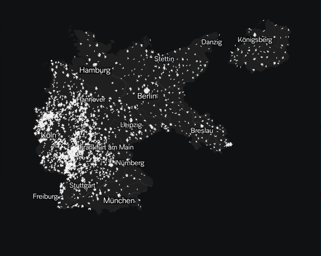
Topography of Violence: Considerations for Ethical and Collaborative Visualization Design
Based on a collaborative visualization design process involving sensitive historical data and historiographical expertise, we investigate the relevance of ethical principles in visualization design. While fundamental ethical norms like truthfulness and accuracy are already well-described and common goals in visualization design, datasets that are accompanied by specific ethical concerns need to be processed and visualized with an additional level of carefulness and thought. There has been little research on adequate visualization design incorporating such considerations. To address this gap we present insights from Topography of Violence, a visualization project with the Jewish Museum Berlin that focuses on a dataset of more than 4,500 acts of violence against Jews in Germany between 1930 and 1938. Drawing from the joint project, we develop an approach to the visualization of sensitive data, which features both conceptual and procedural considerations for visualization design. Our findings provide value for both visualization researchers and practitioners by highlighting challenges and opportunities for ethical data visualization.
Unravelling the Human Perspective and Considerations for Urban Data Visualization
Effective use of data is an essential asset to modern cities. Visualization as a tool for analysis, exploration, and communication has become a driving force in the task of unravelling our complex urban fabrics. This paper outlines the findings from a series of three workshops from 2018-2020 bringing together experts in urban data visualization with the aim of exploring multidisciplinary perspectives from the human-centric lens. Based on the rich and detailed workshop discussions identifying challenges and opportunities for urban data visualization research, we outline major human-centric themes and considerations fundamental for CityVis design and introduce a framework for an urban visualization design space.
Relational perspectives as situated visualizations of art collections
With relational perspectives, we examine the potential of traversing cultural collections along the richness of individual facets and relations through the process of developing an exploration-centered visualization. Cultural collections can contain thousands of artifacts, of which each typically possesses a diverse set of properties and individual facets constituting a unique relationship to the rest of the collection. Therefore, to create an appropriate representation of the complex data of each underlying artifact, oftentimes, it is not only interesting to get an overview of the entire collection from one perspective, but to explore the specific context of an artifact and the various relations it may have to other items. To investigate the potential of relational perspectives, we selected an art collection as a particularly promising case study. By following and reporting from a collaborative and iterative design process with an art museum, we developed a web interface that contrasts a collection overview with three situated visualizations each exposing a different kind of relational perspective on the art collection from an artifact.
The Public Life of Data: Investigating Reactions to Visualizations on Reddit
This research investigates how people engage with data visualizations when commenting on the social platform Reddit. There has been considerable research on collaborative sensemaking with visualizations and the personal relation of people with data. Yet, little is known about how public audiences without specific expertise and shared incentives openly express their thoughts, feelings, and insights in response to data visualizations. Motivated by the extensive social exchange around visualizations in online communities, this research examines characteristics and motivations of people’s reactions to posts featuring visualizations. Following a Grounded Theory approach, we study 475 reactions from the /r/dataisbeautiful community, identify ten distinguishable reaction types, and consider their contribution to the discourse. A follow-up survey with 168 Reddit users clarified their intentions to react. Our results help understand the role of personal perspectives on data and inform future interfaces that integrate audience reactions into visualizations to foster a public discourse about data.
Co-Designing Visualizations for Information Seeking and Knowledge Management
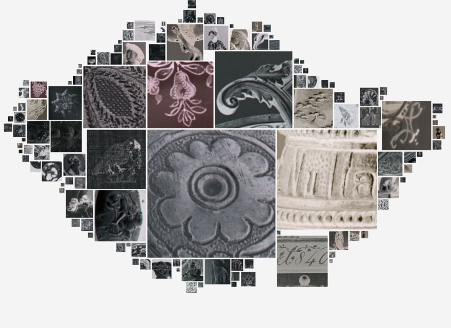
The Close-up Cloud: Visualizing Details of Image Collections in Dynamic Overviews
This paper introduces a visualization technique designed to uncover iconographic patterns prevalent within a collection while at the same time allowing close viewing of these particular details. Challenging an institutionalized understanding of overview and detail as inherently opposed, the intention of this research is to develop a visualization method that accounts for the iconographic abundance of a collection and encourages its casual exploration. Expanding digitization efforts have led to a growing number of rich cultural heritage datasets that are successively being published online. At the same time scholars are exploring the potential of computational methods to expand the scale and scope of art history. In this context, data visualization is often equated with a distanced perspective diminishing the intricate and intriguing details of individual artifacts. In collaboration with a museum of applied and decorative arts, we have devised a novel interface concept for the exploration of image collections such as historical glass plate negatives. Inspired by photographic plates on a light table, the resulting Close-up Cloud translates the art historical method of close viewing into the digital by combining it with a dynamic representation of quantitative iconographic patterns across an entire image collection.
Zwischen Distanz und Nähe. Formen der Betrachtung und Bewegung in (digitalen) Sammlungen
Digitale Sammlungen besitzen den Anspruch, die Sammlung in ihrer Gesamtheit zu veröffentlichen; sie entstammen ursprünglich intern erstellten und genutzten Datensätzen aus einem abgeschlossenen Sammlungsfundus; sie zeigen die Objekte nicht im Ausstellungsraum, sondern als einzelne Digitalisate; und sie ermöglichen eine Vielfalt an Zugängen. Trotz der zunehmenden Komplexität und Reichhaltigkeit der musealen digitalen Angebote und der damit anwachsenden Datensätze ist der Zugang zu diesen Sammlungsinterfaces noch oft auf Such- oder Filtermöglichkeiten und eine Anzeige über KachelBildergalerien beschränkt. Ausgehend davon, dass jede Repräsentation von Daten immer nur eine eingeschränkte Annäherung an eine objektive Wirklichkeit darstellen kann, ist die besondere Beleuchtung von Datensätzen unter unterschiedlichen Aspekten erstrebenswert. Neben gezielter Fokussierung auf einzelne Datendimensionen, halten wir in Bezug auf digitale Sammlungen kultureller Artefakte speziell den Wechsel zwischen unterschiedlichen Stufen von Distanz und Nähe für besonders ergiebig. Distanz und Nähe haben in Bezug auf Sammlungsvisualisierungen jeweils gänzlich unterschiedliche Qualitäten, welche die wissenschaftliche Exploration und das kulturelle Erleben der Sammlung bereichern können und beschreiben nicht nur besondere Arten der Betrachtung kultureller Bestände, sondern ebenso verschiedene Modi der Bewegung durch die digitale Sammlung, zwischen den Objekten und entlang ihrer Arrangements. Zwischen Distanz und Nähe liegen somit nicht nur verschiedene Granularitäten, sondern ebenso eine Vielfalt an Ansichten, die jeweils besondere Formen der Analyse und Erkenntnisgewinnung anregen.
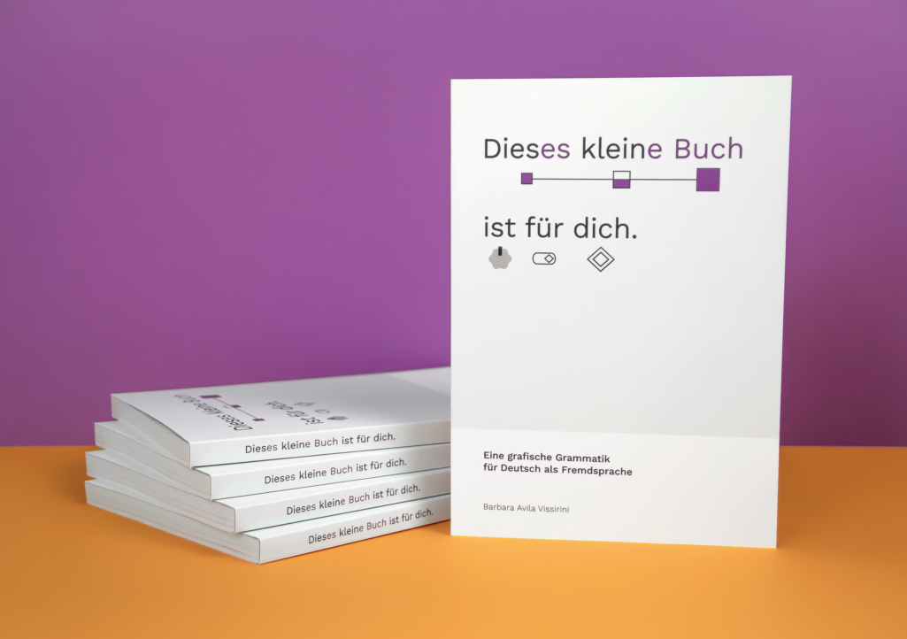
A Visual System for Grammar Instruction in Foreign Language Learning
Complementary to verbal explanations, visual techniques are often implemented in grammar instruction to help learners process information. Highlighting using typograhic features can help distinguish the structure in focus from its context, aiding information seeking and drawing attention to important features. Additionally, visual encoding can associate graphical traits to grammar categories to support the identification and recognition of related structures and language patterns.
An analysis of current grammar books for German as a foreign language has shown, however, that a combination of multiple encoding techniques representing coexistent grammar categories can be challenging to make sense of. The absence of a global design strategy within a book generates inconsistent and sometimes conflicting grammar representations, which can lead to misunderstandings and create a hindered and fragmented learning experience.
In order to avoid such conflicts, this research presents design guidelines to combine both techniques efficiently and introduces a visual system developed for German as a foreign language. In addition to indicating a word’s class, similar to Montessori Grammar Symbols, this system uses text appearance and symbols to indicate further grammar features relevant for non-native speakers, such as grammatical gender, case declension, verb tense, etc. By maintaining a consistent visual character, such support fosters structure recognition and comparison as well as pattern identification throughout all grammar representations. Initially developed for the German language, this systematic approach of associating grammar categories with visual features could be adapted to create new systems for other languages.
The Fold: Rethinking Interactivity in Data Visualization
We propose the philosophical notion of the fold as an evocative vocabulary for the design and critique of interactive data visualizations. An expanding range of application areas, such as digital art history and literary studies, illustrates the potential of data visualization for research and education in the humanities. Coinciding with the increasing currency of data as evidence in the humanities, this research addresses a growing interest in data visualization for visual analysis and argumentation. For example, cultural collection visualizations promise a range of possibilities for visual and interactive representations of digital cultural heritage, used both for free exploration and focused research. Based on the concept of the fold, prominently advanced by Gilles Deleuze, this paper outlines a critical framework that draws attention towards the complexity of the underlying data. The fold offers a way to analyze and conceptualize visualizations through the lens of three integrated operations: explication, implication, and complication. It is an opportunity to think of interactive visualizations as portals into coherent, elastic, and ultimately infinite information spaces. Accordingly, it rejects the separation between interactivity and visual encoding and draws attention to the transitions between multiple states of a visualization. We identify design patterns of the fold in data visualizations, devise a framework for the critical interpretation of interactivity in data visualization, and demonstrate the implications for the digital humanities.
Reading Traces: Scalable Exploration in Elastic Visualizations of Cultural Heritage Data
Through a design study, we develop an approach to data exploration that utilizes elastic visualizations designed to support varying degrees of detail and abstraction. Examining the notions of scalability and elasticity in interactive visualizations, we introduce a visualization of personal reading traces such as marginalia or markings inside the reference library of German realist author Theodor Fontane. To explore such a rich and extensive collection, meaningful visual forms of abstraction and detail are as important as the transitions between those states. Following a growing research interest in the role of fluid interactivity and animations between views, we are particularly interested in the potential of carefully designed transitions and consistent representations across scales. The resulting prototype addresses humanistic research questions about the interplay of distant and close reading with visualization research on continuous navigation along several granularity levels, using scrolling as one of the main interaction mechanisms. In addition to presenting the design process and resulting prototype, we present findings from a qualitative evaluation of the tool, which suggest that bridging between distant and close views can enhance exploration, but that transitions between views need to be crafted very carefully to facilitate comprehension.
Visuelle Exploration zweier musealer Sammlungen
Die Neukonzeption der Online-Sammlungen der Staatlichen Museen zu Berlin ist eines der wichtigsten und umfassendsten Projekte innerhalb des Teilprojekts Visitor Journeys neu gedacht. Ziel ist es, die Objekte der Staatlichen Museen zu Berlin auch im virtuellen Raum angemessen und zeitgemäß zur Verfügung zu stellen. Die Forschungskooperation mit dem Urban Complexity Lab der Fachhochschule Potsdam ist Teil dieser Neukonzeption, indem sie die Möglichkeiten der Visualisierung und Exploration heterogener Sammlungsbestände untersucht. Mit Methoden aus dem Interfacedesign, der Human-Computer-Interaction und der Informationsvisualisierung wurden in einem interdisziplinären Team innovative und relevante Zugänge erforscht und prototypisch umgesetzt. Als Ziel wurde formuliert, dass die Sammlungen der Staatlichen Museen zu Berlin in ihrer heterogenen Zusammensetzung erfasst und die verschiedenen Objektarten, Fachdisziplinen und Spezifika im Ganzen und im Detail visualisiert werden. So sollte ein Überblick über die Vielfalt der Bestände der Staatlichen Museen zu Berlin verdeutlicht, aber auch ein Einstieg in die spezifischen Zusammensetzungen der Sammlungen ermöglicht werden.
Die Falte: Ein Denkraum für interaktive und kritische Datenvisualisierungen
Wir schlagen den philosophischen Begriff der Falte als Denkraum für die Gestaltung und Interpretation interaktiver Datenvisualisierungen vor. Visualisierungen geisteswissenschaftlicher Sammlungen bieten spannende Möglichkeiten für interaktive Repräsentationen, welche die Sammlungen und ihre zugrundeliegenden Objekte zugänglich machen, sie aber ebenso kritisch beleuchten sollten. Dies führt nicht selten zu komplexen und teils widersprüchlichen Anforderungen an die entstehenden Visualisierungen. Das von Gilles Deleuze ausgearbeitete Konzept der Falte eröffnet einen Denkraum, der die Aufmerksamkeit nicht nur auf die Vielfalt visueller Repräsentation, sondern auch auf die vermeintliche Objektivität der zugrundeliegenden Daten lenkt. Darüber hinaus bietet die Falte eine Möglichkeit, Visualisierungen durch die Linse von drei integrierten Operationen zu analysieren und zu konzeptualisieren: Explikation, Implikation und Komplikation. Durch diese Linse betrachtet werden interaktive Visualisierungen zu Portalen, welche Zugang zu kohärenten, elastischen und letztlich unendlichen Informationsräumen anbieten können.
SoNAR (IDH): Datenschnittstellen für historische Netzwerkanalyse
In diesem anwendungsbezogenen Forschungs- und Entwicklungsprojekt werden systematisch forschungsorientiert das Aufbereiten, Bereitstellen und Analysieren von Massendaten für den Aufbau einer Forschungstechnologie für die Historische Netzwerkanalyse (HNA), die als ein Zweig der SNA historische Fragestellungen untersucht, erprobt.
Participatory Deep Maps: Towards Discursive User Engagement With Data Visualizations
This paper introduces the concept of deep participatory maps, an approach to democratizing the way local knowl- edge is collected, shared, and discussed using interactive data visualizations. While geovisualizations provide a useful frame of reference for mapping spatial data and local knowledge, generally, they remain artifacts of a uni- directional creation and communication process: from the data source to the audience. This process is curated by the cartographer, visualization designers, or any other author. Typically, this results in a singular perspective onto the underlying data and the represented issues. […]
Narrelations — Visualizing Narrative Levels and their Correlations with Temporal Phenomena
We present findings from interdisciplinary research at the intersection between literary studies, information visualization, and interface design. Despite a growing interest in text visualization among literary scholars, so far, narrative visualizations are not designed to support the particular tasks involved in narratological analysis and often fail to reveal nuanced narratological features. One major outcome of our iterative research and design process is Narrelations, a novel visualization technique specifically suited for analyzing and interpreting narrative levels of a story and temporal aspects of its narrative representation. The visualization provides an overview of the nesting and distribution of narrative levels, integrates the representation of temporal phenomena, and facilitates the examination of correlations between these aspects. With this research we explore how collaboratively designed visual encodings and interaction techniques may allow for an insightful analysis at a high level coupled with a close inspection of text passages. We discuss prior work relevant to our research objectives and explain the specific characteristics of narrative levels and temporal aspects of narrative representation. After describing the research process and design principles, we apply the visualization on a test corpus of eight annotated German short stories and demonstrate its heuristic value for literary analyses and interpretations. In particular, we explore the intricate connections between the literary content of the novellas and their narrative form.
Close-Up Cloud: Gaining A Sense Of Overview From Many Details
After two decades of steady increases in image resolution through technical advances in image sensors, we are now also witnessing a significant growth in comprehensively tagged image collections. Concurrently cultural institutions have been digitizing their collections, while cultural scholars have been investing considerable efforts into the annotation of images to denote iconographic details and historical context. Despite these developments, existing interfaces to access image collections do not harness the possibilities provided by rich visual details of high-resolution images and detailed tags associated with them.
A particularly promising development, however, is the growing research interest in visualization to support the analysis and exploration of cultural heritage data [Windhager et al., 2018]. In this context, art historians are experimenting with digital methods, in particular visualization [Bailey and Pregill, 2014], to explore their potential for expanding the scale and scope of art history [Drucker, 2013; Manovich, 2015]. In these experiments, digital methods tend to be equated with a distanced perspective on the phenomenon [Moretti, 2013] with the result that many visualizations provide high-level overviews that diminish the intricate and intriguing details of individual artifacts [Hochman and Manovich, 2013; Hristova, 2016].
With this research we present an approach towards visualization that is challenging the understanding of overview and detail as something inherently opposed. We introduce a technique that clusters iconographic details of images in order to reveal visual patterns prevalent in a collection.
Relational Perspectives as Situated Visualizations of Art Collections
With relational perspectives we explore the potential of a new type of approach for the exploration of cultural collections. Cultural collections can contain thousands of artifacts, of which each typically possesses a diverse set of properties constituting a unique relationship to the rest of the collection. Therefore, to create an appropriate representation of the complex data of each underlying artifact, oftentimes it is not only interesting to get an overview about the entire collection from one perspective, but to explore the particular context and relations of individual items. To investigate the potential of relational perspectives we selected an art collection as a particularly promising case study. By following a collaborative and iterative design process with an art museum, we developed a web interface that contrasts a collection overview with three perspective-dependent views to examine the viability of this approach and to expose the diversity of each artifact.
Skalierbare Exploration. Prototypenstudie zur Visualisierung einer Autorenbibliothek am Beispiel der ›Handbibliothek Theodor Fontanes‹
Der Beitrag stellt einen vom Theodor-Fontane-Archiv der Universität Potsdam in Kooperation mit der Fachhochschule Potsdam entwickelten Prototyp zur explorier- und skalierbaren Visualisierung einer Autor*innenbibliothek und der darin enthaltenen Lektürespuren vor. Ziel ist die Verbindung gestaltungsorientierter Ansätze zur Visualisierung kultureller Sammlungen mit philologisch-, archiv- und bibliothekswissenschaftlichen Forschungsfragen. Das im Projekt entwickelte Visualisierungskonzept legt einen besonderen Fokus auf die kontinuierliche, auf mehreren Granularitätsebenen zoom- und filterbare Navigation innerhalb einer Autorenbibliothek, die die Erkundung einzelner Objekte ebenso zulässt wie deren Vergleich. Die Erfahr- und Erfassbarkeit der Sammlung als Ganzes und der sich in ihr abbildenden Lektüre- und Benutzungsmuster stehen dabei ebenso im Zentrum wie Zugänge zu Einzelphänomenen.
Zwischen Repräsentation und Rezeption – Visualisierung als Facette von Analyse und Argumentation in der Kunstgeschichte
Digitale Technologien verändern nicht nur die Rezeptionsmöglichkeiten musealer Bestände im Kontext von digitalen Ausstellungen und Vermittlung, sie haben gleichzeitig zu einer methodischen Erweiterung geisteswissenschaftlicher Forschung beigetragen. Der vorliegende Beitrag untersucht in diesem Zusammenhang die Potenziale von Visualisierung für die kunstgeschichtliche Forschung, Lehre und Wissensvermittlung. Neben einer Begriffsklärung und Einführung in die Grundprinzipien computergestützter Visualisierungstechniken illustriert der Beitrag anhand von existierenden Beispielen aus der Praxis die erörterten Mechanismen und Anwendungsmöglichkeiten. Der Fokus liegt dabei auf den Potenzialen, die Informationsvisualisierung für die Repräsentation und Rezeption von kunsthistorischen Daten und Bildquellen bereithält. Hierbei wird der Einsatz von Visualisierung als Analysemethode innerhalb eines Forschungs- und Erkenntnisprozesses sowie als Mittel zur Präsentation von Ergebnissen und bildgestützter Argumentation beschrieben.
Shifted Maps: Revealing spatio-temporal topologies in movement data
We present a hybrid visualization technique that integrates maps into network visualizations to reveal and analyze diverse topologies in geospatial movement data. With the rise of GPS tracking in various contexts such as smartphones and vehicles there has been a drastic increase in geospatial data being collect for personal reflection and organizational optimization. The generated movement datasets contain both geographical and temporal information, from which rich relational information can be derived. Common map visualizations perform especially well in revealing basic spatial patterns, but pay less attention to more nuanced relational properties. In contrast, network visualizations represent the specific topological structure of a dataset through the visual connections of nodes and their positioning. So far there has been relatively little research on combining these two approaches. Shifted Maps aims to bring maps and network visualizations together as equals. The visualization of places shown as circular map extracts and movements between places shown as edges, can be analyzed in different network arrangements, which reveal spatial and temporal topologies of movement data. We implemented a web-based prototype and report on challenges and opportunities about a novel network layout of places gathered during a qualitative evaluation.
Off the Grid: Visualizing a Numismatic Collection as Dynamic Piles and Streams
This research explores the merit of alternative arrangements of cultural artifacts to expose the aesthetic abundance of a cultural collection. The conventional display of museum objects in online interfaces tends to neglect the physical gestalt of the collection. For example, coins typically end up in tabular grids of thumbnail pages in online collections mimicking their rigid placement in storage drawers of a depot and glass cabinets in exhibitions. The overall aim behind this research was to devise visualizations that do justice to the material and semantic richness of an entire collection, while providing a casual mode of access that is inviting to people with no background in numismatics. To do this, we undertook an iterative design process, which involved a close collaboration with numismaticians and playful ideation with actual coins. Carefully negotiating expert knowledge and lay curiosity, the resulting visualization represents the collection’s dimensions using thousands of thumbnails as visual data points. The coins can be arranged into various layouts such as piles representing, for example, metal types, or streams visualizing the ebb and flow of coins over the centuries. In the interface, one can play with the coins in a manner that would be unthinkable in a physical exhibition and that has not been tried in a digital display. The article reports on the overall research and design process of this project, the resulting interface concept and prototype, and the feedback received during two evaluations.
Visualization of Cultural Heritage Collection Data: State of the Art and Future Challenges
After decades of digitization, large cultural heritage collections have emerged on the web, which contain massive stocks of content from galleries, libraries, archives, and museums. This increase in digital cultural heritage data promises new modes of analysis and increased levels of access for academic scholars and casual users alike. Going beyond the standard representations of search-centric and grid-based interfaces, a multitude of approaches has recently started to enable visual access to cultural collections, and to explore them as complex and comprehensive information spaces by the means of interactive visualizations. In contrast to conventional web interfaces, we witness a widening spectrum of innovative visualization types specially designed for rich collections from the cultural heritage sector. This new class of information visualizations gives rise to a notable diversity of interaction and representation techniques while lending currency and urgency to a discussion about principles such as serendipity, generosity, and criticality in connection with visualization design. With this survey, we review information visualization approaches to digital cultural heritage collections and reflect on the state of the art in techniques and design choices. We contextualize our survey with humanist perspectives on the field and point out opportunities for future research.
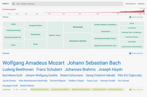
Die bibliografischen Daten der Deutschen Nationalbibliothek entfalten
Wie sieht die Zukunft der Recherche in digitalen Bibliothekskatalogen aus? Wie können umfangreiche und heterogene Sammlungsbestände mit Hilfe von Datenvisualisierungen besser zugänglich gemacht werden? Kann man durch eine digitale Bibliothek flanieren und dabei den Bestand auf ganz neue Art entdecken? Diese Fragen standen im Zentrum eines Forschungsprojekts, das ein interdisziplinäres Team von Forscherinnen und Forschern des Urban Complexity Lab der FHP im vergangenen Jahr in Kooperation mit der DNB durchgeführt hat. Dieser Artikel stellt das Hauptergebnis des Projekts vor: DNBVIS, der Prototyp eines experimentellen Kataloginterfaces. Anschließend werden die Vorgehensweise und wichtigsten Erkenntnisse des Projekts zusammengefasst.
Zur Weiterentwicklung des “cognition support”: Sammlungsvisualisierungen als Austragungsort kritisch- kulturwissenschaftlicher Forschung
Interfaces und Methoden der Informationsvisualisierung dienen insbesondere in Bezug auf abstrakte und komplexe Gegenstände der Unterstützung, Verstärkung und Augmentierung der menschlichen Kognition (Arias-Hernandez et al., 2012). Sammlungen des kulturellen Erbes (Galerien, Bibliotheken, Archive und Museen) sind Paradebeispiele für solche komplexen Gegenstände: sie organisieren und bereiten tausende Objekte auf und stellen diese gemeinsam mit assoziierten Informationen für Forschung und Öffentlichkeit bereit. Viele dieser Sammlungen sind mittlerweile digitalisiert im Netz zugänglich, womit lokale Sammlungs-Interfaces und große Aggregatoren zu Portalen von neuen Informationsräumen werden, in denen Kultur erlebbar und verhandelbar wird.
Ausgangspunkt unseres Vortrags ist eine aktuelle Studie zu Sammlungsinterfaces, die Methoden der Informationsvisualisierung nutzen um kognitive Operationen wie Exploration, Navigation und Analyse auf verschiedenen Ebenen einer Sammlung zu unterstützen. Im Vortrag werden wir einige der durch die Studie gewonnenen Erkenntnisse vertiefen und die Frage ins Zentrum stellen, wie Visualisierungsinterfaces auch jene kognitiven Operationen fördern können, die im kulturwissenschaftlichen Kontext als “kritische” tradiert werden. Analog zu existierenden Definitionen (vgl. Jaeggie & Wesche, 2009; Foucault, 1990; und Butler, 2001) verstehen wir Kritik als jene Form der Kognition, die einen Gegenstand – und das ihn konstituierende Forschungssystem – in seiner Umwelt kontextualisiert und einer Bewertung unterzieht. Dabei bündelt die Operation i) analytisches und exploratives Wissen über Struktur und Dynamik ihres Gegenstands, ii) eine Bewertung im Sinne einer differenzierten Vermessung von Aktualität und Potentialität des Gegenstands, iii) eine Offenlegung und Argumentierung der instrumentalisierten Maßstäben und Normen, sowie oftmals eine iv) Ableitung von Handlungsoptionen zur (Selbst)berichtigung und (Selbst)Steuerung des fokussierten und des fokussierenden Systems.
Mit direktem Bezug auf Fragestellungen des Calls entwickeln wir ein Analyseschema, um dieses Potenzial für Visualisierungssysteme zu kulturellen Sammlungen zu erkunden und diskutieren Designstrategien, um entsprechende Funktionen zu stärken.
Der Sammlung gerecht werden: Kritisch-generative Methoden zur Konzeption experimenteller Visualisierungen
Das Versprechen hinter Digitalisierungsprojekten in sammelnden Institutionen ist oft die Erweiterung des Zugangs zum kulturellen Erbe, sei es für die Forschung oder im Sinne der Vermittlung. Bei kritischer Betrachtung fast aller Benutzerschnittstellen für Sammlungen scheint es aber an Ansätzen zu fehlen, reichhaltige Informationsräume einladend bereitzustellen. Diese Diskrepanz zwischen Digitalisierung von Sammlungen und ihrer digitalen Verfügbarmachung lässt sich dadurch begründen, dass Kultureinrichtungen selten über die nötige Kapazität verfügen, eigenständig Benutzerschnittstellen zu konzipieren und umzusetzen. Die Zielstellung des dreijährigen Forschungsprojektes Visualisierung kultureller Sammlungen (VIKUS) an der Fachhochschule Potsdam1 war die Erforschung graphischer Benutzerschnittstellen zur explorativen Sichtung von Kulturobjekten. Im Projekt wurden in Kooperation mit Kultur- und Technologiepartnern Erkenntnisse zur visuellen Exploration digitalisierter Sammlungen gewonnen (Glinka et al. 2017a), die Entwicklung nachhaltiger Technologielösungen behandelt (Glinka et al. 2017b) und in experimentellen Settings kritisch-generative Methoden erprobt. Zu letzterem zählt die Übertragung der Forschungsfragen in den Kontext eines interdisziplinären Lehrformats, welches wir in unserem Beitrag diskutieren. Wir gehen insbesondere auf den produktiven Zusammenhang zwischen Kritik und Konzeption von Informationsvisualisierungen ein und zeigen auf, welche Potenziale ein bewusster Bruch mit disziplinären Konventionen und Sehgewohnheiten mit sich bringt.
One view is not enough: High-level visualizations of a large cultural collection
As cultural institutions are digitizing their artifacts and interlinking their collections, new opportunities emerge to engage with cultural heritage. However, it is the often comprehensive and complex nature of collections that can make it difficult to grasp their distribution and extent across a variety of dimensions. After a brief introduction to the research area of collection visualizations, this paper presents a design study visualizing an aggregated collection from diverse cultural institutions in Germany. We detail our iterative design process leading to prototypical implementations of four stylistically and functionally coordinated visualizations, each one focusing on different facets of the collection.
Memory Dialogue – Exploring Artefact-Based Memory Sharing
With the proliferation of personal and social computing there is an increased interest in the field of human-computer interaction to support people’s memory practises. Yet, there is only a limited understanding of the role of artefacts in the social dynamics in memory. With memory dialogue, we introduce a methodology for exploring artefact-based memory sharing. Participants created physical or digital memory artefacts, exchanged them, and reflected on the process. Our qualitative findings show how this method can help uncover the complexity of shared memory. Participants largely chose bonding experiences and created artefacts as conversation starters about differences in their memories.
Tracing exploratory modes in digital collections of museum websites using reverse information architecture
Museums are broadening their program beyond the physical institutions by providing digital collections online. In digital collections, objects are prepared and presented particularly for the Web and the ambition is to provide the entirety of a physical collection. To make these rich and comprehensive data sets accessible, an explore mode is increasingly offered. The present study considers this mode, first by making sense of the term “exploration” and suggesting four functional principles in support of exploration in digital collections — view, movement, contextualization, and participation. On this basis, we compare eight well-known museums with regard to the explore modes for their digital collections. We have devised a three-part methodology, reverse information architecture, to address the question: How is the function of exploration manifested in the structure and interface elements of digital collections? With this unique method we use the given content to investigate how far the four principles are implemented in explore modes of digital collections and, broadly said, how explorable they are. The introduced approach to studying digital collections could be opened up to other fields to analyze a variety of Web interfaces in general.
Past Visions and Reconciling Views: Visualizing Time, Texture and Themes in Cultural Collections
We present a case study on visualizing a collection of historic drawings along its metadata structure while also allowing for close examination of the artifacts’ texture. With regards to the specific character of cultural heritage at the intersection of research, education, and public interest, the presented visualization environment aims at meeting the requirements of both researchers as well as a broader public. We present the results from a collaborative interdisciplinary research project that involved a cultural heritage foundation, art historians, designers, and computer scientists. The case study examines the potential of visualization when applied to, and developed for, cultural heritage collections. It specifically explores how techniques aimed at visualizing the quantitative structure of a collection can be coupled with a more qualitative mode that allows for detailed examination of the artifacts and their contexts by displaying high-resolution views of digitized cultural objects with detailed art historical research findings. Making use of latest web technologies, the resulting visualization environment allows for dynamic filtering and zooming of a collection of visual resources that are arranged along a contextualized timeline. We share insights from our collaborative design process and the feedback and usage data gathered during the deployment of the resulting prototype as a web application. We end with a discussion of transferability of carefully crafted and collaboratively negotiated visualizations of cultural heritage and raise questions concerning the applicability of our approach to related strands of humanities research.
Von sammlungsspezifischen Visualisierungen zu nachnutzbaren Werkzeugen
Die Entwicklung digitaler Werkzeuge lässt sich als wichtiger Teilbereich in den Digital Humanities identifizieren (Davis und Kräutli 2015; Schnapp et al. 2009). Entsprechende Forschung und Projektarbeit steht dabei komplexen Herausforderungen gegenüber. Nicht nur die Frage nach verfügbaren Daten, methodologischer Fundierung und technologischer Umsetzbarkeit, sondern auch die Frage nach deren langfristigen Verfügbarmachung sind wiederkehrende Themen der letzten Jahre. Eine zentrale Rolle für die Sicherstellung von Qualität und Anwendbarkeit der digitalen Werkzeuge ist die Einbindung von Forscher_innen der jeweiligen geisteswissenschaftlichen Disziplinen im Entwicklungsprozess (Drucker 2013). Gleichzeitig lässt sich die zentrale Bedeutung von Interfacedesign, Nutzungsanleitungen und Benutzerfreundlichkeit als wichtige Faktoren für die Etablierung von digitalen Werkzeugen im Forschungsprozess feststellen (Gibbs und Owens 2012). Doch selbst wenn diese Herausforderungen bewältigt werden und ein digitales Werkzeug (erfolgreich) entwickelt wurde, stellt sich weiterhin die Frage, wie die langfristige Nachnutzung im Sinne einer digitalen Nachhaltigkeit sichergestellt werden kann. Am Beispiel des Entstehungsprozesses einer sammlungsspezifischen Visualisierung und deren Weiterentwicklung zu einem nachnutzbaren Werkzeug werden einige zentrale Aspekte der beeinflussenden Faktoren und Lösungsansätze vorgestellt. Unser Beitrag stellt sich somit der Frage, wie sichergestellt werden kann, dass digitale Tools auch über die Laufzeit von Förderprojekten hinaus (und unabhängig von spezifischen Use-cases) dauerhaft nutzbar und weiterentwickelbar sind.
Museale Bestände im Web: Eine Untersuchung von acht digitalen Sammlungen
Museen erweitern ihr Vermittlungsangebot immer mehr über die physische Einrichtung hinaus, u.a. durch die Bereitstellung Digitaler Sammlungen im Web. Digitale Sammlungen zeichnen sich dadurch aus, dass die in ihnen gezeigten Objekte speziell für das Web aufbereitet und präsentiert werden. Der Anspruch besteht dabei darin, die Gesamtheit der musealen Sammlungen zur Verfügung zu stellen. Um diese umfassenden Datensätze zugänglich und ein Schlendern durch die Bestände zu ermöglichen, wird innerhalb der Digitalen Sammlungen zunehmend ein sogenannter Explore-Modus angeboten. Auf der Basis einer Untersuchung des Begriffes der Exploration wurden im Rahmen dieser Arbeit acht bekannte Museen im Hinblick auf die Explore-Modi ihrer Digitalen Sammlungen miteinander verglichen und analysiert. Es wurde eine dreiteilige Methode mit dem Namen Reverse Information Architecture entwickelt, um die folgende Frage zu beantworten: Wie manifestiert sich die Funktion der Exploration in der Struktur und den Interface-Elementen der Digitalen Sammlungen? Mit der entwickelten Methode wird der Inhalt der Websites analysiert, um zu untersuchen, inwiefern Konzepte der Exploration in den Digitalen Sammlungen umgesetzt werden.
Visualizing the spatiality in fictional narratives
This work is part of ongoing research on the visualization of spatial relationships in fictional works. Our aim is to arrive at aesthetic representations of fictional narratives set in actual places such as cities. Novel City Maps offers two map views, one inspired by transit maps and the other by conventional street maps. The former uses the aesthetic of abstract transit maps to reveal the co-occurrence structures between important places in a story. The street map view is designed as a spatial fingerprint of a novel by highlighting the places occurring often in the story.
Staged Analysis: From Evocative to Comparative Visualizations of Urban Mobility
In this paper we examine the concept of staged analysis through a case study on visualizing urban mobility exhibited in a public gallery space. Recently, many cities introduced bike-sharing in order to promote cycling among locals and visitors. We explore how citizens can be guided from evocative impressions of bicycling flows to comparative analysis of three bike-sharing systems. The main aim for visualizations in exhibition contexts is to encourage a shift from temporary interest to deeper insight into a complex phenomenon. To pursue this ambition we introduce cf. city flows, a comparative visualization environment of urban bike mobility designed to help citizens casually analyze three bike-sharing systems in the context of a public exhibition space. Multiple large screens show the space of flows in bike-sharing for three selected world cities: Berlin, London, and New York. Bike journeys are represented in three geospatial visualizations designed to be progressively more analytical, from animated trails to small-multiple glyphs. In this paper, we describe our design concept and process, the exhibition setup, and discuss some of the insights visitors gained while interacting with the visualizations.
Linking structure, texture and context in a visualization of historical drawings by Frederick William IV (1795-1861)
In this article we present a case study on digital representation of the art historical research and metadata brought together for a scientific collection catalogue by the Prussian Palaces and Gardens Foundation Berlin-Brandenburg. The resulting interface aims at linking the structure and texture of a collection of drawings by Frederick William IV of Prussia (1795–1861) with additional contextual information. The article describes the context of the larger research project and presents the resulting visualization and interaction techniques specifically designed for dynamic exploration along time and subjects.
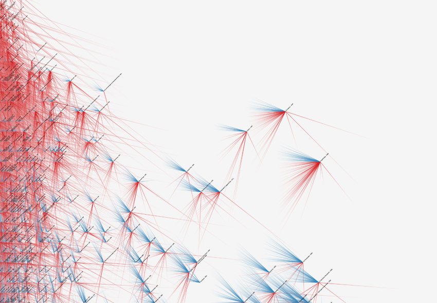
Culturegraphy
Culturegraphy visualizes the exchange of cultural information over time. Treating cultural works as nodes and influences as directed edges the visualization of these cultural networks can provide new insights into the rich interconnections of cultural development such as movie references. All findings were made in a process that involved network scientists, a media theorist, and a sociologist. The role that visualization can play in bridging scientific communities was central to this work. In this sense, the resulting visualizations were process to bring researchers from different disciplines together. Traditionally using different methods, physicists increasingly ask similar questions as media theorists or sociologists as they study the dynamics in networks. Visualization can serve as a common language that brings fields together, shows differences, but also has its own idiosyncratic views.
Emosaic: Visualisierung von Emotionen in Texten durch Farbumwandlung zur Analyse und Exploration
Das computergestützte Extrahieren und Visualisieren von Emotionen in Texten ist eine etablierte Technik des “Distant Reading”. Die generelle Stimmung eines Textes kann schnell erfasst werden ohne den gesamten Text lesen zu müssen. Da Emotionen sehr komplex und die Eigenschaften zwischen verschiedenen Emotionen fließend sind, ist die visuelle Charakterisierung von Emotionen schwierig. Wir stellen Emosaic vor, ein Online-Tool welches Emotionen aus benutzerdefinierten Texten filtert und durch systematische und nachvollziehbare Farbumwandlung zur Exploration und Analyse innerhalb einer interaktiven Visualisierung bereitstellt. Die durch drei Dimensionen beschreibbaren Emotionen werden dabei in klar definierte Farbparameter übersetzt. Ein von uns entwickelter öffentlich zugänglicher Web-Prototyp zeigt anhand interaktiver Visualisierungen erste Analyse- und Explorationsmöglichkeiten dieser Methode (http://emosaic.de).
Archival Liveness: Designing with Collections Before and During Cataloguing and Digitization
We present “archival liveness” as a concept in design and the Digital Humanities and describe its development within a Research Through Design process. Working with a newly acquired archive of contemporary poetry we produced designs that both manifested and “geared in to” [Durrant 2011] [Gurwitsch 1979] the temporal rhythms of the work and infrastructure of archiving. Drawing on user-centred work with participants, often poets themselves, we focused on marginalia as a material feature of the archive, developing a drawing machine and live Twitter bot. Our work addresses institutional concerns for outreach and engagement while also acknowledging and exploiting the inevitably incomplete or live character of archival collections. For designers working with digital archives, we demonstrate the pragmatic and critical value of liveness as a focus of the design process.
Museum im Display. Visualisierung kultureller Sammlungen (VIKUS)
Im Rückgriff auf Ausstellungspraktiken im Museum stellt der Artikel Bezüge zwischen Erkenntnissen aus der Visualisierungsforschung und der Rezeption von Museumssammlungen in einem Ausstellungsdisplay her. Besondere Beachtung finden hierbei Makro- und Mikroperspektiven auf Sammlungen und Darstellungen im (digitalen) Display eines Museums. Visualisierungen können einen offenen und explorativen Zugang zu den digitalisierten Beständen bieten, der eher den Ausstellungs- und Vermittlungsaktivitäten des Museums entspricht oder diese ergänzt. Dabei werden die Potenziale der digitalen Präsentation herausgearbeitet und Anhand von Use Cases aus der Forschung illustriert, welche Ansätze in der facettierten und „kuratierten“ Inszenierung von Sammlungen umgesetzt werden können.
Probing Projections: Interaction Techniques for Interpreting Arrangements and Errors of Dimensionality Reductions
We introduce a set of integrated interaction techniques to interpret and interrogate dimensionality-reduced data. Projection techniques generally aim to make a high-dimensional information space visible in form of a planar layout. However, the meaning of the resulting data projections can be hard to grasp. It is seldom clear why elements are placed far apart or close together and the inevitable approximation errors of any projection technique are not exposed to the viewer. Previous research on dimensionality reduction focuses on the efficient generation of data projections, interactive customisation of the model, and comparison of different projection techniques. There has been only little research on how the visualization resulting from data projection is interacted with. We propose a set of interactive visualization methods to examine the dimensionality-reduced data as well as the projection itself. The methods let viewers see approximation errors, question the positioning of elements, compare them to each other, and visualize the influence of data dimensions on the projection space. We created a web-based system implementing these methods, and report on findings from an evaluation with data analysts using the prototype to examine multidimensional datasets.
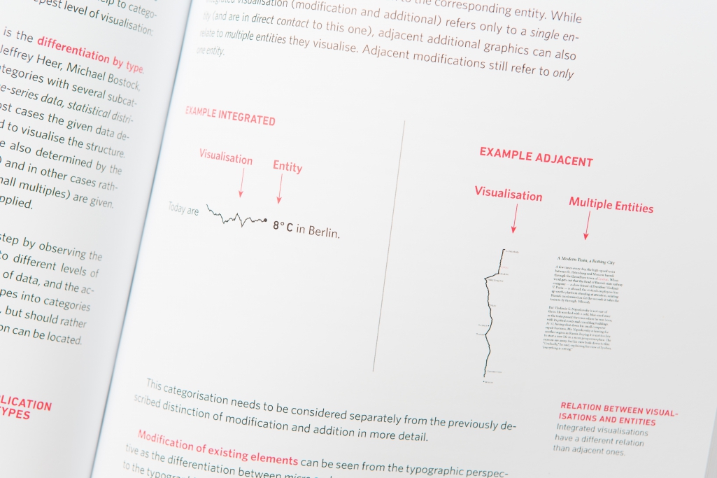
Micro Visualizations: Data-driven typography and graphical text enhancement
At the intersection of information visualization and typography lies the design space of micro visualization, a family of basic techniques enriching text in regard of its accessibility, comprehensibility, and memorability. We propose a taxonomy that differentiates specific types of visualizations applied to text design and layout. We elaborate two main approaches to aligning the visual appearance of a text and its content. The first explores the addition of graphical elements embedded into or adjacent to a text, while the other approach explores the visual modification of a text by means of typographic visualization. For this we evaluate how different techniques can be used as visual variables.
Are there networks in maps? An experimental visualization of personal movement data
Shifted Maps proposes a novel visualization method to generate personal geovisualizations of individual movement data. The resulting visual appearance can be characterized as a map network consisting of visited places and their connections. The visited places are shown as circular map extracts scaled according to the time spent there and the movements between the places are represented as edges between the places. A key feature of the Shifted Maps visualization is the possibility to explore the data in three different arrangements based on geo-spatial position, travel time, and frequency of movements. By combining map and network visualizations of movement data, it becomes possible to analyze and compare spatial and temporal topologies.
Visualising the »Un-seen«: Towards Critical Approaches and Strategies of Inclusion in Digital Cultural Heritage Interfaces
In recent years, access to cultural heritage has been closely connected to digitisation. We argue the case for recognising this digital shift as an opportunity to create interfaces to cultural heritage that are, first of all, more inviting to the public. Secondly, we want to encourage critical approaches towards the representation of cultural production and allow for alternative or even conflicting narratives and interpretations to surface. We present related work, use cases, and concepts for visualisations and interfaces that invite the reconsideration of modes of categorisation, presentation and clustering. Our intent is to develop ways to scrutinise modes of exclusion, carry out critical evaluations and pursue interventional strategies. We discuss the specific potential of visualisation, annotation and dynamic expansion of digital cultural collections. Building on critical approaches in human-computer interaction, visualisation and cultural theories, we explore how the interface could be a means of reflection, critique and inclusion.
WordWanderer: A Navigational Approach to Text Visualisation
Text visualisations provide visual representations of documents or small corpora with the primary aim of supporting language analysis. We are interested in developing a more playful approach to language that can be characterised by the notion of wandering as an open-ended movement. To support such a casual form of engagement with text, we designed the WordWanderer system: a visualisation technique that extends tag clouds into a navigational interface for text. The tool supports the gradual movement between word ‘context views’, which represent the words that co-occur in the vicinity of the selected word, and word-‘comparison views’, which arrange words based on their association strengths between two selected words. We report on the encouraging feedback from a ten-day deployment of the interface and present promising directions for future design and research.
Visual Filter: Graphical Exploration of Network Security Log Files
Network log files often need to be investigated manually for suspicious activity. The huge amount of log lines complicates maintaining an overview, navigation and quick pattern identification. We propose a system that uses an interactive visualization, a visual filter, representing the whole log in an overview, allowing to navigate and make context-preserving subselections with the visualization and in this way reducing the time and effort for security experts needed to identify patterns in the log file. This explorative interactive visualization is combined with focused querying to search for known suspicious terms that are then highlighted in the visualization and the log file itself.
Weaving a Carpet from Log Entries: a Network Security Visualization Built with Co-Creation
We created a pixel map for multi-variate data based on an analysis of the needs of network security engineers. Parameters of a log record are shown as pixels and these pixels get stacked to represent a record. This allows a broad view of a data set on one screen while staying very close to the raw data and to expose common and rare patterns of user behavior through the visualization itself (the “Carpet”). Visualizations that immediately point to areas of suspicious activity without requiring extensive fltering, help network engineers investigating unknown computer security incidents. Most of them, however, have limited knowledge of advanced visualization techniques, while many designers and data scientists are unfamiliar with computer security topics. To bridge this gap, we developed visualizations together with engineers, following a co-creative process. We will show how we explored the scope of the engineers’ tasks and how we jointly developed ideas and designs. Our expert evaluation indicates that this visualization helps to scan large parts of log fles quickly and to defne areas of interest for closer inspection.
Culturegraphy — Visualizing Cultural Network Dynamics
Culturegraphy visualizes cultural information exchange over time. Treating cultural works as nodes and influences as directed edges, the visualization of these cultural networks can provide new insights into the rich interconnections of cultural development. The graphics represent complex relationships of movie references by combining macro views summarizing 100 years of movie influences with micro views providing a close-up look at the embedding of individual movies. The macro view shows the rise of the self-referential character of postmodern cinema, while the micro level illustrates differences between individual movies, when they were referenced and by whom. The visualizations provide views that are closer to the real complexity of the relationships than aggregated views or rankings could do.
Monadic Exploration: Seeing the Whole Through Its Parts
Monadic exploration is a new approach to interacting with relational information spaces that challenges the distinction between the whole and its parts. Building on the work of sociologists Gabriel Tarde and Bruno Latour we turn to the concept of the monad as a useful lens on online communities and collections that expands the possibility for creating meaning in their navigation. While existing interfaces tend to emphasize either the structure of the whole or details of a part, monadic exploration brings these opposing perspectives closer together in continuous movements between partially overlapping points of view. We present a visualization that reflects a given node’s relative position within a network using radial displacements and visual folding. To investigate the potential of monadic exploration we report on an iterative design process of a web-based visualization of a highly cross-referenced book and its six-month deployment.
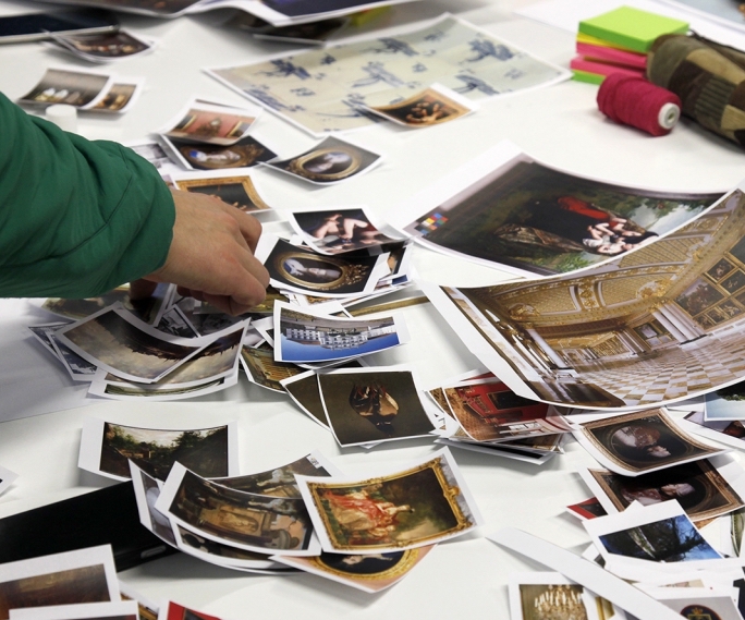
Exploring the Promises and Potentials of Visual Archive Interfaces
A photo archive contains diverse narratives that only get partially exposed in digital interfaces. In this paper we explore a potential framework for archivists and designers to create photo archive interfaces that are sensitive to the ethos and social context of its content. We outline our approach to engaging with archival projects and present the results of a pilot workshop, which raised a range of complex questions about the design of visual interfaces. Our aim is to practically and conceptually expand how a visual interface would let a visitor access, explore, and interpret the contents of an archive. To do this we are interested in the different associations that people weave between the artefacts of an archive.
Visually Exploring Books Along Their Subject Headings
We present a visualization of subject headings that typically accompany books as flat textual metadata. The purpose of the visualization is twofold: first to expose the implicit structure in subject headings as an overview of a library collection and second to present a visual web of keywords to invite exploration of books. Taking a tag cloud as a starting point, the visualization extends it to a networked tag cloud that respects the hierarchy that is implicit in subject headings. By allowing an information seeker to successively build a subject filter, while seeing the results at each step, we hope to improve the searcher’s orientation in a comprehensive book collection.
Indexicality and Visualization: Exploring Analogies with Art, Cinema and Photography
In this paper we offer a critical discussion of data visualization by adapting theories of indexicality as discussed in semiotics and art history. An indexical statement is broadly one whose meaning is dependent on context. We examine how indexicality has informed practices in cinema, photography, and contemporary art and make comparisons with data visualization. Specifically, we explore how these analogies can result in generative concepts that can inform the design and study of data visualization.
Critical InfoVis: Exploring the Politics of Visualization
As information visualization is increasingly used to raise awareness about social issues, difficult questions arise about the power of visualization. So far the research community has not given sufficient thought to how values and assumptions pervade information visualization. Taking engaging visualizations as a starting point, we outline a critical approach that promotes disclosure, plurality, contingency, and empowerment. Based on this approach, we pose some challenges and opportunities for visualization researchers and practitioners.
Accentuating Visualization Parameters to Guide Exploration
We present a new method for displaying visualization parameters to guide casual data exploration. When visualizing datasets with large parameter spaces it can be difficult to move between data views. Building on social navigation and degree-of-interest visualization, we propose the concept of accentuation as the selection and emphasis of visualization parameters based on social and semantic signals. We describe how we designed an accentuated visualization interface, and discuss open challenges and directions for future research.